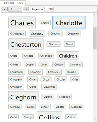
The integration client tool I talked about in the previous post, we need to display the list of words in a way similar to tag clouds in blog post.
For this we will use a ListView with some customization (see Xaml code below).
Paging
A more important question is the number of items to show. As we, in most cases, have thousands of items to display, we need a paging mechanism.
A solution – a Linq extension - proposed by https://stackoverflow.com/users/69313/wim-haanstra was a good base for a generic paging module:
// credit: https://stackoverflow.com/users/69313/wim-haanstra
// usage: MyQuery.Page(pageNumber, pageSize)
public static class LinqPaging
{
    // used by LINQ to SQL
    public static IQueryable<TSource> Page<TSource>(this IQueryable<TSource> source, int page, int pageSize)
    {
        return source.Skip((page - 1) * pageSize).Take(pageSize);
    }

    // used by LINQ
    public static IEnumerable<TSource> Page<TSource>(this IEnumerable<TSource> source, int page, int pageSize)
    {
        return source.Skip((page - 1) * pageSize).Take(pageSize);
    }

}

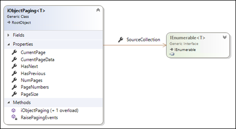
iObjectPaging is now a generic class accepting any collection of data to be paged through calls to the Linq extension.
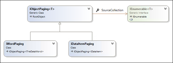
Let us derive, from this base, a two specific paging classes: one for our words and another for our documents (DataItems):

That is all what we need for paging. Each list will simply assign its data to the corresponding paging object and the UI elements will be bound to the CurrentPageData collection. Next / Previous buttons will allow navigating through the collection pages.
The main view model, for instance, declares a paging member:
protected iWordPaging _wordPaging = new iWordPaging(200);
And assigns its Words collection to this paging member whenever the collection changes:
_wordPaging.SourceCollection = ItemList?.AllWords;
Words as Tag Cloud
A ListView control should be customized for this.
We need to customize its ItemsPanel and ItemTemplate:
<ListView x:Name="listItems"
			Grid.Row="1"
			ItemsSource="{Binding WordPaging.CurrentPageData, IsAsync=True}"
			BorderBrush="#FFA3A3A4" BorderThickness="1"
			SelectedItem="{Binding SelectedWord, Mode=TwoWay, IsAsync=True}" Background="{x:Null}"
			Padding="12" ScrollViewer.HorizontalScrollBarVisibility="Disabled"
			>
   <ListBox.ItemsPanel>
       <ItemsPanelTemplate>
          <WrapPanel MaxWidth="{Binding ElementName=listItems, Path=ActualWidth, Converter={StaticResource widthConverter}}" HorizontalAlignment="Left" Height="auto" Margin="12,0,12,0" />
       </ItemsPanelTemplate>
   </ListBox.ItemsPanel>

   <ListView.ItemTemplate>
       <DataTemplate>
          <local:iWordCtrl DataContext="{Binding }" Width="120" Height="40" />
       </DataTemplate>
    </ListView.ItemTemplate>
  </ListView>
Data items grid
A DataGrid bound to the selected Word data items will display its (paged) data items:
<DataGrid ItemsSource="{Binding CurrentPageData, IsAsync=True}">
   <DataGrid.Columns>
    …
    …
With this in place, we are now able to:
- Navigate though word pages
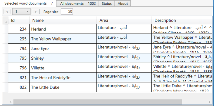
- When the selected word changes, its related data (paged) items (e-books) are displayed in the DataGrid…
- Next / Previous buttons can be used to navigate, and will be enabled or disabled according to the paging context (see paging base class in the diagram above)
- A list of pages (combo box) can also allow to go to a specific page

Sample paged datagrid of e-books containing the selected word

In a next post, we will see the database integration process