Taoffi's blog

prisonniers du temps

covid-5ync – dna analysis helper application: progress!

A quick post to talk about the progress in this project with a few technical details.

First, a screen capture of what it looks like today (just a little better than before!):


The first version of the application is already online: click-once installation. And Yes, we don't have money to have a certificate for the deployment… install only if you trust!... any suggestions about sponsors are also greatly welcome!


A few features implemented:

  • Search for string and search for the 'complementary' of string.
  • Paging
  • Zoom-in / out on the sequence

Next steps:

  • Search enhancement: visually locate occurrences
  • Search for unique fragments according to user-provided settings
  • Open file / save selection

Long-term:

  • … endless


Now, let us take a quick dive into the mechanics

The first class diagram (updated source code with such documentation is @github)

That seems quite basic(!), actually, as the reality of DNA, and that is one reason it is also fascinating!

  • A sequence (iDnaSequence) is composed of 'nodes' (iDnaNode)
  • A node is noted as a char. It refers to a 'base'.
  • Commonly a set of 4 bases is used ('a', 't', 'g' and 'c'). There may be more, but we can easily handle this when needed.
  • Each individual base has a complementary 'Pair'. A is pairable with T, C with G
  • The 'standard' set of bases (iDnaBaseNucleotides) is a (singleton) list of the 4 bases. It sits as the main reference for nodes. It provides answers to important questions like: is 'c' a valid base?... what the complementary of 'X'?... what is the complementary sequence of the string "atgccca"? and so on.


Visual presentation: a start point

There are many ways to present a DNA sequence. To start with something, let us assign a color to each base. The user can later change this to obtain a view according to his or her work area. Technically speaking, we have some constraints:

  • The number of nucleotides of a sequence can be important. For coronavirus, that is roughly 29000. We therefor need 'paging' to display and interact with a sequence.
  • Using identification colors for nucleotides can also help to visually identify meaningful regions of the sequence on hand. For this to be useful, we need to implement zoom-in/out on the displayed sequence.


Paging

I simply used the solution exposed in a previous post about doc5ync.


Zoom-in / out

I found a good solution through a discussion on Stack Overflow
(credit: https://stackoverflow.com/users/967254/almulo).

  • Find the scroll viewer of the ListView.
  • Handle zoom events as required
var presenter        = UiHelpers.FindChild<ScrollContentPresenter>(listItems, null);
var mouseWheelZoom = new MouseWheelZoom(presenter);
PreviewMouseWheel += mouseWheelZoom.Zoom;


Sample screen shots of a zoom-out / in

More details later in a future post.

Please send your remarks, suggestions and contributions on github.

Hope all that will be useful in some way… Time is running… Humanity will prevail

doc5ync Trie integration tool - UI Tag cloud, paging and navigation

The integration client tool I talked about in the previous post, we need to display the list of words in a way similar to tag clouds in blog post.

For this we will use a ListView with some customization (see Xaml code below).

Paging

A more important question is the number of items to show. As we, in most cases, have thousands of items to display, we need a paging mechanism.

A solution – a Linq extension - proposed by https://stackoverflow.com/users/69313/wim-haanstra was a good base for a generic paging module:


// credit: https://stackoverflow.com/users/69313/wim-haanstra
// usage: MyQuery.Page(pageNumber, pageSize)
public static class LinqPaging
{
    // used by LINQ to SQL
    public static IQueryable<TSource> Page<TSource>(this IQueryable<TSource> source, int page, int pageSize)
    {
        return source.Skip((page - 1) * pageSize).Take(pageSize);
    }

    // used by LINQ
    public static IEnumerable<TSource> Page<TSource>(this IEnumerable<TSource> source, int page, int pageSize)
    {
        return source.Skip((page - 1) * pageSize).Take(pageSize);
    }

}

trie-with-data-paging-base

iObjectPaging is now a generic class accepting any collection of data to be paged through calls to the Linq extension.

Let us derive, from this base, a two specific paging classes: one for our words and another for our documents (DataItems):

trie-with-data-paging-2

That is all what we need for paging. Each list will simply assign its data to the corresponding paging object and the UI elements will be bound to the CurrentPageData collection. Next / Previous buttons will allow navigating through the collection pages.

The main view model, for instance, declares a paging member:

protected iWordPaging	_wordPaging	= new iWordPaging(200);

And assigns its Words collection to this paging member whenever the collection changes:

_wordPaging.SourceCollection	= ItemList?.AllWords;


Words as Tag Cloud

A ListView control should be customized for this.

We need to customize its ItemsPanel and ItemTemplate:

<ListView x:Name="listItems" 
			Grid.Row="1" 
			ItemsSource="{Binding WordPaging.CurrentPageData, IsAsync=True}" 
			BorderBrush="#FFA3A3A4" BorderThickness="1"
			SelectedItem="{Binding SelectedWord, Mode=TwoWay, IsAsync=True}" Background="{x:Null}"
			Padding="12" ScrollViewer.HorizontalScrollBarVisibility="Disabled"
			>
   <ListBox.ItemsPanel>
       <ItemsPanelTemplate>
          <WrapPanel MaxWidth="{Binding ElementName=listItems, Path=ActualWidth, Converter={StaticResource widthConverter}}" HorizontalAlignment="Left" Height="auto" Margin="12,0,12,0" />
       </ItemsPanelTemplate>
   </ListBox.ItemsPanel>

   <ListView.ItemTemplate>
       <DataTemplate>
          <local:iWordCtrl DataContext="{Binding }" Width="120" Height="40" />
       </DataTemplate>
    </ListView.ItemTemplate>
  </ListView>
 

Data items grid

A DataGrid bound to the selected Word data items will display its (paged) data items:

<DataGrid ItemsSource="{Binding CurrentPageData, IsAsync=True}">
   <DataGrid.Columns>
    …
    …


With this in place, we are now able to:

  • Navigate though word pages
  • When the selected word changes, its related data (paged) items (e-books) are displayed in the DataGrid…
  • Next / Previous buttons can be used to navigate, and will be enabled or disabled according to the paging context (see paging base class in the diagram above)
  • A list of pages (combo box) can also allow to go to a specific page


trie-with-data-paged-word-cloud


Sample paged datagrid of e-books containing the selected word

trie-with-data-paged-datagrid

In a next post, we will see the database integration process

Revisiting the Trie –applied to text search and indexing [.net]

A Trie is an efficient tree structure for storing and searching hierarchically-structured information.

For more detailed information you may have a look Here, Here or Here… to mention a few.

In this article, I take 'Text' as the information to be handled.

Text can be viewed as a tree of 'character' nodes. Each set of these nodes compose a 'Word' building block. Several 'Words' building block may share a same set of character nodes.

Let us look at words like: trie, tree, try, trying. All of them share the 't' and 'r' root nodes. 'try' and 'trying' have their 't', 'r', 'y' as common nodes. This can be presented in the following simple diagram:

Or, in a more graphical presentation, like the figure below (green nodes represent end of words):


In the case of Text, the efficiency of a Trie is that any word of a given text will start with one of the known alphabetical characters of the language used. Which represents a relatively limited number of nodes.

To enhance our tree structure, we may choose to compose our root nodes with only characters used in the manipulated text (i.e. dynamically compose our root character dictionary).

Trie classes

The following class diagram presents the main Trie model used in the application code:


  • CharDictionaryItem: stores one character information (its 'char' value… from which we can get its int value)
  • CharDictionary: the collection or CharDictionaryItem used as the root dictionary for all nodes
  • TrieNode: a trie node item. It refers to one of the above dictionary's nodes. Contains a IsEndOfWord flag that tells whether the node is the end of a word building bloc. And provides information related to its status and position in the tree (Children, Neighbors, IsExpanded…). Through its tree position and flags, a TrieNode object can provide us with useful information such as 'words' (Strings) found at its specific position.
  • TrieNodeList: a collection of TrieNode items.
  • Trie: is the central object. It contains a CharDictionary and a TrieNodeList. This class is implemented as a singleton in the current sample application.

Collection indexers

Collections (CharDictionary, TrieNodeList) expose a useful indexer that retrieves an item by its character. Those indexers will be used through the code for retrieving items.

TrieNodeList indexer:


public TrieNode this[char c]
{
get { return this.FirstOrDefault(item => item.Character == c); }
}

CharDictionary indexer:


public CharDictionaryItem this[char c]
{
get { return this.FirstOrDefault( item => item.Character == c); }
}

The sample scenario

The sample application proposes the following usage scenario:

  • User selects a text file
  • Parse the file's contents: get its words blocks
  • Compose the root character dictionary
  • Build the words tree
  • Display the presentation tree + additional search functionalities

Parsing text – sample code

Parse text words (having a minimum length: (= 3 chars in the sample app))


int ParseStringTask(string str, int minWordLength)
{
// split text words
string[] words = str.Split(new string[]
{
" ", "\r\n", "(", ")", ",", ".", "'", "\"",
":", "/", "'", "'", "«", "»", "-", "+", "=",
"*", "[", "]", "{", "}", ";", "&", "<",
">", "|", "\\", "`", "^", "…", "\t"    
}, StringSplitOptions.RemoveEmptyEntries);

string word;

foreach (string w in words)
{
word = w.Trim();

if (word.Length >= minWordLength)
{
this.AddString(word); // add this word to the tree
}
}

return this._nodes.Count;
}

AddString method: creates the new dictionary items / adds the tree nodes of a string block (word)


public void AddString(string str)
{
char c = str[0];
CharDictionaryItem dicoItem;
TrieNode firstNode = _nodes[c],
node;
int ndx,
len = str.Length;

if(firstNode == null)
{
// find the dictionary item. add it if none found
dicoItem = GetDictionaryItem(c);
firstNode = _nodes.AddTail(dicoItem);
}

for(ndx = 1; ndx < len; ndx++)
{
c = str[ndx];
node = firstNode.Children[c];
// find the dictionary item. add it if none found
dicoItem = GetDictionaryItem(c);

if(node == null)
{
node = firstNode.Children.AddTail(dicoItem);
}

if(ndx >= len -1)
{
// set the End of word flag
node.IsEndOfWord = true;
}

firstNode = node;
}
}

Reading back the trie words

How to find back our parsed words through the trie?

Here is a sample code to find words located at a given node:

TrieNode.Strings property:


public List<string> Strings
{
get
{
List<string> list = new List<string>();
var childWords = from c in _children where(c._isEndofWord == true) select c;
List<string> neigbors = Next == null ? null : Next.Strings;
string strThis = this.Character.ToString();

// add words found in immediate neighbors
if(childWords != null)
{
string str = strThis;

foreach(TrieNode n in childWords)
{
str += n.Character.ToString();

if(n.IsEndOfWord)
list.Add( str);
}
}

// add words that may be found in child nodes
foreach(TrieNode childNode in _children)
{
foreach(string str in childNode.Strings)
list.Add(strThis + str);
}

return list;
}
}


User interface (WPF)

Trie nodes can easily be presented in a TreeView. According to the trie node flag, its corresponding tree view node should be able to indicate this (through different image in our example, using a Converter)

The Tree view item template may be:


<TreeView.ItemTemplate>
<HierarchicalDataTemplate ItemsSource="{Binding Children}">
<StackPanel Orientation="Horizontal" Margin="0" >
<Image Width="14"
Source="{Binding Converter={StaticResource nodeImageConverter}}"
Margin="0,0" />
<TextBlock Text="{Binding Character}" Padding="4,0"
Margin="4,0" VerticalAlignment="Center" />
</StackPanel>
</HierarchicalDataTemplate>
</TreeView.ItemTemplate>


Searching trie words

Fins words starting with a given string (Trie class)


public List<string> StartsWith(string str)
{
List<String> list = new List<string>();

char c = str[0];
TrieNode node0 = this._nodes[c];

if(node0 == null)
return list;

List<string> strings = node0.Strings;

foreach(string s in strings)
{
if(s.StartsWith(str, true, CultureInfo.CurrentCulture))
list.Add(s);
}
return list;
}


Fins words containing a given string (Trie class)


public List<string> Containing(string str)
{
List<String> list = new List<string>();

if(string.IsNullOrEmpty(str))
return list;

foreach(TrieNode node in this._nodes)
{
var strings = from sx in node.Strings where( sx.Contains(str)) select sx;

foreach(string s in strings)
{
list.Add(s);
}
}

return list;
}


Sample app screenshots


The sample code

You may download the source code Here.

Have fun optimizing the code and adding new features!

A MMXVI side walk: roman numerals

Numeral systems are fascinating!

Presenting values in various numeral systems reveals some hidden aspects of these values and sometimes reveals more about our Human History and knowledge evolution.

Roman is one of these systems. (you may have a look here, here, or here)

A few years ago, I wrote a method to convert decimal numbers into roman. That worked well. The customer wanted a converter for numbering paragraphs. Up to 50 would be largely enough, he said. The developer in my head pushed me up to 9999 (sadly, I abandoned here by lack of time)

A few days ago, I saw someone wearing a T-shirt with 'XCIV' logo. And that reminded me that I never wrote the reverse conversion (from roman to decimal).

That was a good occasion to write this. And as I also have a friend who wants to practice C#, that may be a good exercise.

I found back my old code (to discover it was all to be rewritten!)… and I started working on a new version!

Roman numerals. A brief presentation

As you may know, Roman numerals building blocks are:

Roman

Decimal

I

1

V

5

X

10

L

50

C

100

D

500

M

1000


Intermediate values (like in the table below, between 1 and 10) are additions and subtractions of these basic building blocks

Roman

Decimal


I

1


II

2

1 + 1

III

3

1 + 1 + 1

IV

4

5 – 1

V

5


VI

6

5 + 1

VII

7

5 + 1 + 1

VIII

8

5 + 1 + 1 + 1

IX

9

10 – 1

X

10


Going beyond the M (1000) [presentation and entries]

Roman numerals were, at their era, (an evidence) hand written (probably more often engraved on hard stones!).

That surely does not mean the people did not know or need to count beyond the 1000. We better never forget that numbers and mathematics are much older than our own era… and that most of the great advances in this area had been achieved in other older civilizations!.

My problem here is just a presentation question: how can I write roman numbers beyond the M (1000)?

Old traditionalists use quirky figures that do not seem easily writable using a 'keyboard'.

Like here:

Or here:

To make presentation and entries a little easier with our era's keyboards, I decided to combine other units to create building blocks beyond the 1000. Example: To present the 1000 – 9000 sequence, I used 'XM' and 'VXM':


"XM",

// 10000

"XMXM",

// 20000

"XMXMXM",

// 30000

"XMVXM",

// 40000

"VXM",

// 50000

"VXMXM",

// 60000

"VXMXMXM",

// 70000

"VXMXMXMXM",

// 80000

"CMXM",

// 90000


For the sequence 1m – 9m, I used characters that are not in the traditional roman building blocks: The 'U', 'W' and 'Y':

"U",

// 1000000

"UU",

// 2000000

"UUU",

// 3000000

"UW",

// 4000000

"W",

// 5000000

"WU",

// 6000000

"WUU",

// 7000000

"WUUU",

// 8000000

"UY",

// 9000000


Conversion processing units

The conversion manager object (iRomanNumberDictionary in the above figure) stores a list of roman building blocks.

Each building block corresponds to a decimal sequence factor (1, 10, 100, 1000… etc.) and stores the roman elements of this sequence (see the sample tables above). It also stores the roman group level (a vital info as you will see in the code!)

Decimal to roman

Now, to convert a decimal number into its roman presentation, we proceed this way (here, using 28 as an example):

  • Take the leftmost digit of the number (leftmost of 28 = 2)
  • Set the index of the sequence to look in = count of number's digits - 1 (for 28 that is 2 – 1 = 1)
    • Note: this target sequence is composed of: "X", "XX", "XXX", … etc.
  • Find the value of this sequence at the element index = the leftmost digit – 1 (2 – 1 = 1)
  • In our case, that would be "XX" (which is decimal 20)
  • Recurse call with the remaining digits of the number (remaining of "28" = "8")
    • Note: that call should return "VIII" (first sequence at the 7th position)
  • Add the string to the "XX" (that would then be "XXVIII")


Roman to decimal

Roman to decimal is a bit trickier!

Let us take the reverse conversion of the example above ("XXVIII") for which the conversion result should be 28.

  • The conversion step (a parameter) should be set to the highest index of our roman sequences (in my app, I used 7 sequence groups whose factors are: 1, 10, 100, 1000, 10000… 1000000)
  • We have to look for the string in all sequences whose group order is <= the current step
  • Do until we find something:
    • In our example: we look for "XXVIII" in all sequences whose group order is <= 7
    • As the string is not found in any sequence, we continue the search using the string minus 1 char "XXVII"… "XXVI"… "XXV"… "XX"
    • "XX" is found in the sequence whose decimal factor = 10 at number zero-index = 1
    • We store the following value in a List<int>: sequence's decimal factor * (number zero-index + 1). Which results in 10 * 2 = 20
  • Recurse call using the remaining string "VIII" and using the sequence group order – 1 as the conversion step. Add the returned number to our List<int>
  • Return the sum of integers of our List<int>


To better understand what goes on in the conversion process, I added a conversion history that explains the steps of each conversion.

Here is the processing history for XXVIII (28):


Another processing history for a greater roman number MMMXCVIII (3098):


You may download the code (WPF) HERE. Have fun extending and enhancing for the better!

Xamarin forms maps – let’s talk renderers: 2. Droid

Let us go back to Xamarin Forms Maps!

In a previous post, I exposed a WinPhone custom renderer for maps.

The object of our renderer is to:

  • Display custom pushpin (marker) icon
  • Display a custom info window for each place (pushpin / marker)


The custom renderer

Our Droid custom renderer will derive from MapRenderer and, for reasons we will see later, will implement the GoogleMap.IInfoWindowAdapter:


[assembly: ExportRenderer (typeof(iMaps.iCustomMap),
                                    typeof(iMaps.Droid.iCustomMapViewRenderer))]


namespace iMaps.Droid
{
    public class iCustomMapViewRenderer : MapRenderer, GoogleMap.IInfoWindowAdapter


Customizing the marker icon

In android, markers can relatively easily be customized to show a custom icon. Here, we use the custom icon of our Custom pin


iCustomPin    customPin    = pin.BindingContext as iCustomPin;
string    resourceName    = System.IO.Path.GetFileNameWithoutExtension(customPin.IconResource);
int        resourceId        = Context.Resources.GetIdentifier(resourceName, "drawable",
                                        Context.PackageName);

bmp = BitmapDescriptorFactory.FromResource(resourceId);
marker.SetIcon(bmp);

Setting markers and their custom icons will be done when the map is to be rendered (i.e. in the OnElementPropertyChanged override of our renderer). That is best done once when the map will be ready.

To know when the map is ready, we must implement the IOnMapReadyCallback Interface which defines one only method: void OnMapReady(GoogleMap googleMap). With this in place, google maps will call us when the map is ready.

Our renderer will thus now look like this:

public class iCustomMapViewRenderer : MapRenderer, GoogleMap.IInfoWindowAdapter,
IOnMapReadyCallback

Our OnMapReady method will set variables required for drawing the map.


GoogleMap            _map;

public void OnMapReady (GoogleMap googleMap)
{
    _map        = googleMap;
    _map.InfoWindowClick    += Map_InfoWindowClick;

    // required if you wish to handle info window and its content
    _map.SetInfoWindowAdapter (this);
}

OnElementPropertyChanged of our renderer will proceed to putting the pins on the map:


bool                _isDrawingDone;

protected override void OnElementPropertyChanged (object sender,

                                        PropertyChangedEventArgs e)
{
    base.OnElementPropertyChanged (sender, e);

    if(_map == null || _isDrawingDone || e.PropertyName != "VisibleRegion")
        return;

    _map.Clear ();
    _map.MarkerClick            += HandleMarkerClick;
    _map.InfoWindowClick    += Map_InfoWindowClick;

    foreach (var pin in _mapPins)
    {
        var            marker        = new MarkerOptions ();
        iCustomPin    customPin    = pin.BindingContext as iCustomPin;

        marker.SetPosition (new LatLng (pin.Position.Latitude, pin.Position.Longitude));
        marker.SetTitle (pin.Label);

        if(! string.IsNullOrEmpty(pin.Address))
            marker.SetSnippet(pin.Address);

        BitmapDescriptor    bmp        = null;

        string    resourceName    =
                    System.IO.Path.GetFileNameWithoutExtension(customPin.IconResource);
        int        resourceId        = Context.Resources.GetIdentifier(resourceName,
                                                "drawable", Context.PackageName);

        bmp = BitmapDescriptorFactory.FromResource(resourceId);
        marker.SetIcon(bmp);

        _map.AddMarker(marker);
    }

    _isDrawingDone = true;
}


Customizing the popup info window

Customizing the popup info window is a different kettle of fish ('une autre paire de manche' en françaisJ)

Why?

Simply because the google maps documentation says that the info window is a View, but specify this interesting note:

Note: The info window that is drawn is not a live view. The view is rendered as an image (using View.draw(Canvas)) at the time it is returned. This means that any subsequent changes to the view will not be reflected by the info window on the map.


To update the info window later (for example, after an image has loaded), call showInfoWindow(). Furthermore, the info window will not respect any of the interactivity typical for a normal view such as touch or gesture events. However you can listen to a generic click event on the whole info window as described in the section below.


So, it IS a View… but NOT REALLYJ

Let us be more specific: it is NOT a view. It is actually a Bitmap.


Anyway, to be able to customize the info window, our renderer must implement the GoogleMap.IInfoWindowAdapter Interface. Which defines two methods:

  • View GetInfoContents(Marker marker);
  • View GetInfoWindow(Marker marker);


GetInfoWindow: returns the entire popup window. If it returns null, then it is GetInfoContents which will define the contents of the default info window frame of the marker popup.

As the 'pseudo-view' returned in both cases are not really views but bitmaps, our task is to compose a view of the pin information before transforming this to a bitmap.


In our current exercise, we will return the window content. Therefor our GetInfoWindow() will return null.

public Android.Views.View GetInfoWindow(Marker marker)
{
    return null;
}

From Xamarin Forms Xaml à to Native View à to Bitmap: dangerous tour!

As I am not a 'droid boy', I decided to create a Xamarin Forms control (ContentView) and use this in the custom renderer. You may of course decide differently to use a Droid axml control. In both ways, we will have to convert that control's content into Bitmap.

Here is my ContentView Xaml (assumed to be bound to an iCustomPin):


<StackLayout Spacing="4" >
    <Image Source="{Binding ImageFile}"
            WidthRequest="84" HeightRequest="84" HorizontalOptions="StartAndExpand" />
    <Label FontAttributes="Bold" Text="{Binding Name}" />
    <BoxView HeightRequest="1" BackgroundColor="Gray"
                HorizontalOptions="FillAndExpand" VerticalOptions="Start" />
    <Label x:Name="labelText" Text="{Binding MapPinText}" LineBreakMode="WordWrap" />
</StackLayout>

Our GetInfoContents method will have to:

  • Identify the clicked custom pin
  • Set the binding context of the above ContentView to that pin
  • Transform that XF control to a native Droid ViewGroup
  • Transform the resulting droid native ViewGroup into a bitmap to be returned to Google maps.

The following code illustrates these steps:


iMapPinInfoCtrl        xamInfoPanel    = new iMapPinInfoCtrl();

public Android.Views.View GetInfoContents(Marker marker)
{
    iCustomMap     myMap         = this.Element as iCustomMap;
    iCustomPin     customPin     = myMap.GetPinAtPosition(
                new Position(marker.Position.Latitude, marker.Position.Longitude));
    double            infoWidth        = this.Control.Width * 0.70,
                        infoHeight        = 380.0 / 2.8;
    SamplePlace    place                = customPin.DataObject as SamplePlace;

    xamInfoPanel.BindingContext = place;

    // get the droid native control
    ViewGroup    viewGrp        = DroidXFUtilities.ConvertFormsToNative(
                xamInfoPanel.Content, new Rectangle(0, 0, infoWidth, infoHeight));

    // transform the native control into a bitmap
    Bitmap        bmp            = DroidXFUtilities.ViewGroupToBitmap(viewGrp,
                                                    this.Context,
                                                    (int)infoWidth, (int)infoHeight,
                                                    true);

    _pinImage.SetImageBitmap(bmp);

    return _pinImage;
}

To Native ViewGroup

An interesting post from Michael Ridland helped solve this task!

Get the native droid ViewGroup of XF View code snippet:


public static ViewGroup ConvertFormsToNative(Xamarin.Forms.View view,
                                            Rectangle size)
{
    var        vRenderer        = Platform.CreateRenderer(view);
    var        viewGroup        = vRenderer.ViewGroup;

    vRenderer.Tracker.UpdateLayout();

    var        layoutParams    = new ViewGroup.LayoutParams((int)size.Width, (int)size.Height);

    viewGroup.LayoutParameters        = layoutParams;
    viewGroup.DrawingCacheEnabled    = true;
    view.Layout(size);
    viewGroup.Layout(0, 0, (int)size.Width, (int)size.Height);
    return viewGroup;
}

Native ViewGroup to Droid.Graphics.Bitmap

I must first confess that this task was hard for meJ.

I read some articles about the subject, of which this interesting one "Converting Views to Bitmap Images in Android"… but, in the practical exercise, couldn't grasp how to get precise measures of rendered elements!

The task steps is to:

  • Create a Linear Layout
  • Create a Bitmap and put it into a Canvas
  • Loop through the ViewGroup's elements (Views) and add them to the Layout
  • Draw the Layout into the Canvas
  • Return the Bitmap (which will contain the rendered layout's views)

Getting the precise measures of views is not simple. Notably for images and labels with text wrap attribute.

Here is a simplified snippet of my code (assuming that no images are part of the ViewGroup's elements). The solution's source code has more details about handling images. But you should be able to do much better if you are an android expertJ


public static Android.Graphics.Bitmap ViewGroupToBitmap(ViewGroup viewGroup,
                                             Context context,
                                             int width, int height)
{
    int        viewCount = viewGroup == null ? 0 : viewGroup.ChildCount;
    Android.Widget.LinearLayout layout        = new Android.Widget.LinearLayout(context);
    Bitmap    bmpLayout    = Bitmap.CreateBitmap(width, height, Bitmap.Config.Argb8888);
    Android.Graphics.Color    white        = Android.Graphics.Color.Argb(0xff, 0xff, 0xff, 0xff);

    layout.DrawingCacheEnabled            = true;
    layout.SetBackgroundColor(white);

    Canvas    canvas    = new Canvas(bmpLayout);

    // add the sub views contained in this view group
    for (int ndx = 0; ndx < viewCount; ndx++)
    {
        Android.Views.View view = viewGroup.GetChildAt(0);

        int            wid            = Math.Max(0, view.MeasuredWidth),
                        hi                = Math.Max(0, view.MeasuredHeight);

        viewGroup.RemoveView(view);
        layout.AddView(view, wid, hi);
    }

    layout.Draw(canvas);

    return bmpLayout;
}


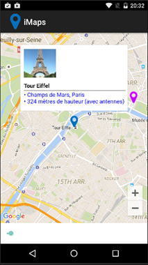
The result looks like this:


You may Download the code Here

XML – the ASCII of our era

At the dawn of XML, Tim Bray once said "XML is the ASCII of the future"… which is now clearly the case!


To ease reading and handling XML files, I started writing an XML browser last year. The 'Open file' menu of the app first proposed '*.xml' file extension.

As you may imagine, quite quickly that expanded to so many other file extensions: *.xml; *.xaml; *.xsd; *.wsdl; *.csproj; *.vbproj; *.dwproj; *.rptproj; *.config; *.dim; *.ds?; *.cube; *.partitions; *.manifest; *.database; *.rsd; *.rds; *.rdl the list is actually endless!

Why write a XML browser / editor?

Most XML tools I found look more like good (some excellent) editors / syntax visualizers. What I needed more was to have a logical image of the tree structure of an XML file: which node is parent of which…

Xml Note Pad did part of this but was more text-editor-oriented than logical structure visualizer. Its most recent version also dates 2007… time is running!

Of course there is not one sole way to handle such question. Visualizing the tree structure is one aspect. Editors with syntax highlighting, nodes expand/collapse… are still of course very useful.

Let us take a simple user control xaml file with the code similar to this:


Viewing the above code's node tree helps better understand its structure:


How can we handle XML tree presentation?

XML code is composed of some foundation elements:

  • The element name (the xml tag… which is part of a namespace).
  • The element property (or properties). Which may be either:
    • A value (string / primitive type)
    • A composite element:
      • A set of attributes
      • And / or a set of child elements


A simple example:

<person gender="female">

Element = person, gender = an attribute whose value is female

  <firstname>Anna</firstname>

firstname (property of person) whose value is Anna

  <lastname>Smith</lastname>

lastname (property of person) whose value is Smith

</person>

End of the composite element person


The above code can also be written like this (1st attribute shifted to a property level):

<person>
  <gender>female</gender>
  <firstname>Anna</firstname>
  <lastname>Smith</lastname>
</person>


You may look here for more information about the XML model.


At our .net level, we have objects defined in System.Xml.Linq that allow us to (more or less easily) explore, traverse and query a XML tree. Some of these:

  • XDocument (derives from à XContainer à XNode à XObject)
  • XElement (derives from à XContainer à XNode à XObject)


These xml-specialized objects are indispensable to safely communicate with the xml model, but are not good candidates for a view to represent the xml tree.

In some way, in a MMVM pattern, they represent the model (and business logic). We need an intermediate component that can be integrated into a view model and a view.

Property Bags to the rescue

I briefly mentioned property bags in a previous post about MSBuild browser. Let me elaborate a little more about this.

A property bag is a set of abstracted properties. Where a property is presented as:

  • A name
  • A data type
  • A value

And where the property 'value' can be either:

  • An object or primitive value (string for instance)
  • Or a set of properties (i.e. a property bag)


This model proved quite useful in many contexts. You may for instance transform any object into a property bag representing its properties (in a strongly-typed form). This can be quite useful in situations where loose coupling is a concern (applications ßà services for instance). I will talk about this in details later in a following post.


For our current question about presenting xml trees, property bag model seems to be in sync with the xml model:

Xml element:

name / value / attributes / sub-elements (children)

Property bag element:

name / value / sub-elements (children)


To clarify by the practice, here is an example for parsing a XElement attributes into a property bag:


static PropertyBag ParseXmlNodeAttributes(XElement xnode, ObjProperty parent)
{
    // create a property bag as a child of the parent property
    PropertyBag targetBag    = new PropertyBag(parent);

    // add the xml element attributes to the bag
    foreach (XAttribute attrib in xnode.Attributes())
    {
        targetBag.Add(attrib.Name.LocalName, attrib.Value);
    }

    return targetBag;
}


Parsing a XElement can be done in a few steps:

  • Create an ObjProperty with name = xml element's name
  • If the element's value is composite (attributes and/or child items): add element's attributes and children to the ObjProperty Children
  • Otherwise set the ObjProperty value to the element's value


The following code illustrates this (simplified version of the code for clarity)


public static PropertyBag ParseXml(XElement xnode, ObjProperty parent)
{
    string            propertyName    = xnode.Name.LocalName;
    PropertyBag    bagObject        = new PropertyBag(propertyName);
    ObjProperty    property            = new ObjProperty(propertyName);
    PropertyBag    bagAttributes    = new PropertyBag();
    PropertyBag    bagSubItems    = new PropertyBag();

    // get the XEelement attributes' bag
    bagAttributes    = ParseXmlNodeAttributes(xnode, property);

    // add attributes (if any) to Children
    if (bagAttributes.Count > 0)
    {
        bagObject.AddRange(bagAttributes);
    }

    // add sub elements if any
    var        subNodes        = xnode.Descendants();

    foreach(var element in subNodes)
    {
        string            nodeName        = element.Name.LocalName;
        PropertyBag    elementBag    = ParseXml(element, property);

        ExtractPropertyValue(bagSubItems, elementBag, nodeName, property);
    }

    bagObject.AddRange(bagSubItems);

    return bagObject;
}


The Xml Property Bags' view model

Presenting a property bag in a view requires some additional properties that are specific for a view. For instance, an 'Expanded' property for a tree node, a 'Selected' property for an item, as well as useful commands and search/filter features… etc.

Our property bag view model will embed the bag item and adds such properties.


The Xml Property Bags' Views

We need to present our xml property bags in either a tree view or a grid view.

As I said earlier, a property bag item contains either a primitive value (which may be presented as a string) or a set of child items.

In a WPF tree view that can be presented like this (code simplified for clarity):

    <!-- import view model namespace -->
    xmlns:vm="clr-namespace:iSoapExplorer2015.viewmodel"


<TreeView x:Name="treeView1" ItemsSource="{Binding Containers}">

    <TreeView.ItemTemplate>
        <!-- hierarchial data template for containers items -->
        <HierarchicalDataTemplate
                    DataType="{x:Type vm:PropertyBagItemVM}"
                    ItemsSource="{Binding Containers}" > <!-- Containers = property bags -->
            <StackPanel Orientation="Horizontal">
                <!—note: 'Node' is the property bag item -->
                <TextBlock Text="{Binding Node.Name}"/>    
            </StackPanel>
        </HierarchicalDataTemplate>

    </TreeView.ItemTemplate>


That results is a view that looks like the one at the beginning of this post (with an image added to the tree view item template)

A data grid view may look like this (again: code simplified for clarity):


<DataGrid ItemsSource="{Binding }">
    <DataGrid.Columns>
        <DataGridTextColumn Header="Property" Binding="{Binding Node.Name}" />
        <DataGridTemplateColumn Header="Value" Binding="{Node.ValueAsString}" />
    </DataGrid.Columns>
</DataGrid>

For a xaml Stack Panel snippet element, our view may look like this (an image column added to the above simplified code):


With some more work, you may implement more useful features and visual effects.

The current version offers: Xml nodes Tree and Grid views, Search nodes (by name and / or value), get the selected node XML, Export the entire tree to an xml file… etc.


I stopped short from editing the nodes (names / values)… but you may add such feature (before I do… probably in a near futureJ)


Here is the current version's binaries.

Have fun adding new features to the source code if you would like to.

Xamarin forms – the OnPlatform<T> heavens!

Xamarin forms offer this class (OnPlatform<T>) of great help to adapt your code (either c# or Xaml) to the current runtime device's platform.

So you may write:

string helloDevice = Device.OnPlatform<string>(
            "Hello iOS", "Hello Droid", "Hello Win Phone");

 At runtime, on iOS, your string would have the related platform value:

In Xaml, you specify the type to which the OnPlatform should act and the values for each platform:

<ContentPage.Padding>
   <OnPlatform x:TypeArguments="Thickness">
      <OnPlatform.iOS>0, 20, 0, 0</OnPlatform.iOS>
      <OnPlatform.Android>0, 0, 0, 0</OnPlatform.Android>
      <OnPlatform.WinPhone>0, 0, 0, 0</OnPlatform.WinPhone>
   </OnPlatform>
</ContentPage.Padding>

The main difficulty in Xaml is that you should know exactly the Type to pass as TypeArgument.

For system known types, you should use the x: prefix like in:

x:TypeArguments="x:String"
x:TypeArguments="x:Double"
x:TypeArguments="x:Int32"

For Xamarin Forms objects properties and types, it is easy to use the Visual Studio Object Browser to obtain the correct information:

Here, for instance, you know that the Padding is of type Xamarin Forms Thickness:

    <OnPlatform x:TypeArguments="Thickness">


Xamarin forms maps – let’s talk renderers: 1. Win Phone

I continue about XF maps, where a custom renderer is needed if you want to customize appearance and interaction.

As most Xamarin forms samples about maps expose renderers for Droid and iOS (I did not see any about WP), I will start by exposing a sample for that 'missing' renderer. Another post will follow with some ideas about the renderers for the other platforms.


In this sample, we handle SamplePlace objects (see below) through our custom map and custom pin objects (see previous post)

What we want:

  • Display custom pushpins (icons specified for each custom pin)
  • When a pushpin is clicked, display a custom information callout about the place.


The way to do this:

The renderer (which derives from MapRenderer) receives our custom map, containing the map pins. The binding context of each Pin is set to the related custom pin. The place data is accessed through the custom pin's DataObject.

The renderer has two levels of duties:

  • A 'formal' role inherited from the default renderer: create and display the specific platform map control, position the pins on it and define the interaction with the control's events (map taps / pins taps / callout taps…).
  • A customization role: use our specific embedded information to customize pins' appearance and callouts.


The renderer code

Our renderer class:

public class iCustomMapRenderer : ViewRenderer<iCustomMap, Map>


For Xamarin.Forms.Maps to retrieve our renderer at runtime, it should be 'exported'. The code should now be like the following:


// Note: ExportRendererAttribute is defined in Xamarin.Forms namespace
[assembly: ExportRenderer(typeof(iCustomMap), typeof(iCustomMapRenderer))]

namespace iMaps.WinPhone
{
	public class iCustomMapRenderer : ViewRenderer<iCustomMap, Map>
	{
		private Map				_winMap;			// the win phone map control
		private iCustomMap		_xfMap;				// the xamarin forms map we are handling
		private iCustomPin		_selectedPin;	// our current slected pin

		// the callout user control that will display selected place info
		UserControl	_placeInfoCtrl	= new UserControl()
		{
			HorizontalAlignment	= HorizontalAlignment.Stretch,
			VerticalAlignment		= VerticalAlignment.Stretch,
			MinHeight			= 300,
			Background			= whiteBrush,
		};
		…


Here is a global view of the renderer's methods:


In the ElementPropertyChanged (override), we will:

  • Create the win phone map control.
  • Parse the received pins, and use their specified icons as pushpins.
  • Subscribe to each pushpin Tap event to display the callout.
  • Subscribe to the map Tap event to hide any displayed callout.


// Center the map on the 1st pin
var			pin	= _xfMap.Pins[0];

// create the win phone map control. set as the native control
_winMap		= new Map
		{
			ZoomLevel = 13,
			Center = new GeoCoordinate(pin.Position.Latitude, pin.Position.Longitude)
		};

this.SetNativeControl(_winMap);

// subscribe to map Tap event (to unselect last pin if any)
_winMap.Tap		+= WinMap_Tap;

// AddCurrentLocationToMap();
// loop through the received pins. display each with its custom pin icon
foreach (var formsPin in _xfMap.Pins)		//.CustomPins)
{
	var			pushPin		= new Pushpin();
	iCustomPin	customPin	= formsPin.BindingContext as iCustomPin;
	SamplePlace	place		= customPin == null ? null 
										: customPin.DataObject as SamplePlace;

	// subscribe to the pushpin tap event (to display the callout)
	pushPin.Tap += PushPin_Tap;

	// set the pushpin position on the map
	var geoCoordinate			= new GeoCoordinate(formsPin.Position.Latitude, formsPin.Position.Longitude);
	pushPin.GeoCoordinate		= geoCoordinate;

	// set the pushpin tag to the custom pin
	pushPin.Tag					= customPin;
	…
	…


The custom pushpin icon

To put a UI element on the map, you create a MapOverlay containing the element on the desired location (geo coordinate) and you add that MapOverlay to a Layer that you put on the map.

A Pushpin (defined in Microsoft.Phone.Maps.Toolkit namespace) is a UI element that exposes a Content property (of type ContentControl) which we can set to our image of choice (the one specified by the custom pin object for instance). In that case, the pushpin would look like this:

We may also directly put our image on the MapOverlay. In that case that would be like this:


The callout control

Let us create a (win phone) xaml UserControl for displaying place object's information. We will use this when a pushpin will be tapped.


<Border x:Name="LayoutBorder" Background="Transparent" Height="auto" Padding="8" >
	<Grid VerticalAlignment="Top" Background="Transparent">
		<Grid.RowDefinitions>
			<RowDefinition Height="24" />
			<RowDefinition />
		</Grid.RowDefinitions>
		<Grid.ColumnDefinitions>
			<ColumnDefinition Width="24" />
			<ColumnDefinition />
		</Grid.ColumnDefinitions>

		<Image Source="{Binding Source, Source={StaticResource imgMapPointer}}" Grid.Column="0" Grid.Row="0" Stretch="Fill" Height="24" Width="24" HorizontalAlignment="Left" VerticalAlignment="Top" />

		<Border Padding="8" Background="White" Grid.Row="0" Grid.Column="1" Grid.RowSpan="2">
			<StackPanel>
				<Image x:Name="imgPlace" Height="128" Width="128" HorizontalAlignment="Left" Source="{Binding Converter={StaticResource placeImageConverter}}" Margin="8" />
				<TextBlock FontWeight="Bold" Text="{Binding Name}" Foreground="Black" />
				<Rectangle Height="1" Fill="Black" HorizontalAlignment="Stretch" />
				<TextBlock Margin="8,0" FontSize="14" Text="{Binding MapPinText}" Foreground="Black" />
			</StackPanel>
		</Border>
	</Grid>
</Border>


At design time, the code above would look like:

At runtime, the Pushpin Tap event handler will set the control's DataContext to the selected SamplePlace object. It will then display its image and information.

The pushpin Tap event handler determines the currently selected place (through the pushpin.Tag) and calls this method to update the control:


void UpdateInfoControlContents(SamplePlace place)
{
	_placeInfoCtrl.ClearValue(UserControl.ContentProperty);

	if(place == null)
		return;

	PlacePushPinInfoCtrl ctrl = new PlacePushPinInfoCtrl() { DataContext = place };

	_placeInfoCtrl.Content = ctrl;
}


There is certainly still much to do for these mechanics to produce something elegant and informative.

That may just be a good start.... Download the code and have more fun!

In a following post I will talk about some ideas for Droid and iOS map renderers (also included in the sample).

Xamarin forms: appCompat & rounded buttons, cleaner solution!

This is a follow up for my last post about AppCompat and rounded buttons where your custom renderer would not be called!

In that post, I exposed a 'hack' solution which is better be avoided.

On this page (the same where Kelly Adams presented a decompiled code of the AppCompat launcher), Thomas Omer-Decugis exposed a simple and efficient solution: you create a new class that derives from Button and create (in the Droid project) your custom renderer for this class.

In that case, your renderer is called and can proceed to handling properties like BorderRadius that are ignored by AppCompat.


public class iRoundedButton : Button 

In this screen capture, the first 2 buttons are standard buttons (where border radius is not handled by AppCompat)

The following 2 are defined as: (xmlns:local="clr-namespace:iRoundedButton")

<local:iRoundedButton … 


And where the custom renderer handles the border radius.


The custom renderer itself is the same as in the previous sample, with this minor change:

[assembly: ExportRenderer(typeof(iRoundedButton /*Xamarin.Forms.Button*/), typeof(CustomButtonCompatRenderer))]

Xamarin Forms Maps – a (very) quick start!

Solutions to avoid some pitfalls for starting up with Xamarin forms maps package.

Before to use?

Some steps are required for your map application to be able to start and to display maps.


In Android project, before to use maps, you must first generate an API key. This can be done in your google account (create one if needed). You can optionally in this step link your API key to a specific application. This API key should be specified in the AndroidManifest.xml of your Android project:

<application android:label="Your app name" android:icon="@drawable/your icon">
    <meta-data android:name="com.google.android.geo.API_KEY"
            android:value="put you api ur key" />
<meta-data android:name="com.google.android.gms.version"
        android:value="@integer/google_play_services_version" />
</application>


In this same file, you should also specify the required location access permissions:


For iOS, you should specify the some values for the following keys in info.plist file:

<key>NSLocationAlwaysUsageDescription</key>
<string>Please allow us to use your location.</string>
<key>NSLocationWhenInUseUsageDescription</key>
<string>We are using your location</string>


For WinPhone, you should specify some application capabilities as (at least):


For All platforms:

In each platform, call Xamarin.FormsMaps.Init(); after Xamarin.Forms.Forms.Init()

Without this call, your map will not show!

  • iOS - AppDelegate.cs file, in the FinishedLaunching method.
  • Android - MainActivity.cs file, in the OnCreate method.
  • Win Phone - MainPage.xaml.cs file, in the MainPage constructor.


That is what the Xamarin Forms Maps documentation saysJ. In fact I tested: that is required for iOS, not required for Android… and for Win Phone… just a minute… the emulator is starting up… IT IS required!


How to use?… Look at it working

To use these items, you simply insert a Map View in your Xaml page (or ContentView). Which can also be done in code. In xaml, don't forget to mention the namespace!

Here is an example of a ContentView (a UserControl for our WPF/Silverlight friends!)

<?xml version="1.0" encoding="UTF-8"?> 
<ContentView    x:Class="iMaps.iMapCtrl1" 
    xmlns="http://xamarin.com/schemas/2014/forms" 
    xmlns:x="http://schemas.microsoft.com/winfx/2009/xaml" 
    xmlns:map="clr-namespace:Xamarin.Forms.Maps;assembly=Xamarin.Forms.Maps" 
    > 
    <map:Map x:Name="theMap" /> 
</ContentView> 


Important remark: for a mysterious reason (you will see many in Xamarin environment), if the 'map' namespace specifies the assembly's extension ('.dll') that doesn't work in WinPhone (i.e. app crash!)

Should write this:

xmlns:map="clr-namespace:Xamarin.Forms.Maps;assembly=Xamarin.Forms.Maps"

Not this (results in WinPhone crash):

xmlns:map="clr-namespace:Xamarin.Forms.Maps;assembly=Xamarin.Forms.Maps.dll"


Now, for this sample, we can insert some Pins at the ContentView (UserControl) creation:

public iMapCtrl1()
{
    InitializeComponent();
    PutSomePinsOnMap();
}


void PutSomePinsOnMap()
{
    // define a center point and some sample pins
    Position        tourEiffel    = new Position(48.859217, 2.293914);
    Pin[]        pins            =
    {
        new Pin() {  Label = "Tour Eiffel",
            Position = new Position(48.858234, 2.293774), Type = PinType.Place },
        new Pin() {  Label = "Concorde",
            Position = new Position(48.865475, 2.321142), Type = PinType.Place },
        new Pin() {  Label = "Étoile",
            Position = new Position(48.873880, 2.295101), Type = PinType.Place },
        new Pin() {  Label = "La Défense",
            Position = new Position(48.892418, 2.236180), Type = PinType.Place },
    };

    foreach(Pin p in pins)
    {
        theMap.Pins.Add(p);
    }

    // center the map on Tour Eiffel / set the zoom level
    theMap.MoveToRegion(MapSpan.FromCenterAndRadius(tourEiffel, Distance.FromKilometers(2.5)));
}


Once this ContentView in a Page that gives a nice view like this: