Check boxes and Radio buttons are two UI elements frequently used in many apps.
In Xamarin forms those two (standard) items seem to create so many discussions without really getting a final answer. Many approaches go through 'custom renderers'… and I finally dislike this. That is simply because it questions the very reason why we use Xamarin forms itself. If everyone is going to create 'custom renderers' for such standard controls, it may become useless for XF to evolve providing new standard renderers… and there will be fewer reasons to use XF (see this post).
Like for Buttons (see this post), I think a check box or radio button can be defined as a surface containing graphical shapes (and animations) to represent the state of a property. In the case of such buttons: Checked/Unchecked state (a simple Boolean).
Waiting for XF to bring us a 'standard' check box and radio button, we have to manufacture them ourselves in the less costly possible way: avoiding custom renderers (again: because custom renderers will, one day, conflict with XF standard renderers)
The case of radio buttons is more interesting for an example because the selected (checked) option is exclusive: it should automatically uncheck all other options of one same group.
There is an interesting sample here. The only thing is that it again uses custom renderers where I think we don't need them.
To illustrate this in a simple way: a radio button can be checked:

Or unchecked:

All what we need is to select the image (or path… or whatever graphical shape) related to the current option state.
Naturally, this graphical element is accompanied by a Label (or image…) which describe the related option.
As you will see in the sample code, there is much more work to represent the Option's state objects than the graphical UI part that represents this state!
The radio button control (ContentView)
The radio button control (ContentView) may look like this:
- A grid with two column cells
- The left cell contains the two images of the option states checked/unchecked. One of them is hidden (according to current option state).
- The right cell contains the description of the option (here: a Label)
<ContentView.Content>
    <Grid>
        <Grid.ColumnDefinitions>
            <ColumnDefinition Width="28" />
            <ColumnDefinition />
        </Grid.ColumnDefinitions>

        <Image x:Name="imgUnselected" />
        <Image x:Name="imgSelected" IsVisible="{Binding IsSelected}" />
        <Label Grid.Column="1" Text="{Binding Label}"/>
    </Grid>
</ContentView.Content>
To show this simple control in action, we have to create some objects to represent the option group object and the option object.
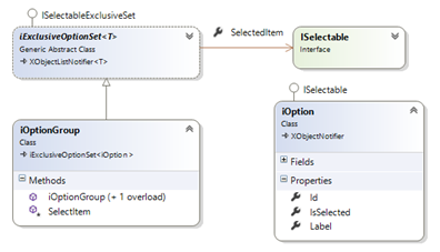
- ISelectable Interface defines the elementary option
Note: the ISelectable (wording and Interface) have been borrowed from this interesting blog: Adventure in Xamarin Forms.
- IExclusiveOptionSet is a template collection of ISelectable options which, in the same time, implements the ISelectableExclusiveSet Interface (see below)
public abstract class iExclusiveOptionSet<T> : XObjectListNotifier<T>, ISelectableExclusiveSet
                        whereT : ISelectable
- XObjectListNotifier<T> list template is a root collection responsible of notifying collection changes (please see the sample code for more information)
- The ISelectableExclusiveSet Interface is defined as:
public interface ISelectableExclusiveSet
{
    string        Label                { get; set; }
    ISelectable    SelectedItem    { get; set; }
}
- Finally, for this sample, a demo (singleton) class provides some options to demo:
iOptionGroup _sampleOptionGroup    = new iOptionGroup("Sample option group");


_sampleOptionGroup.Add(new iOption(){ Id = 1, Label = "Sample option 1", IsSelected = true });
_sampleOptionGroup.Add(new iOption(){ Id = 2, Label = "Sample option 2", IsSelected = false });
_sampleOptionGroup.Add(new iOption(){ Id = 3, Label = "Sample option 3", IsSelected = false });
_sampleOptionGroup.Add(new iOption(){ Id = 4, Label = "Sample option 4", IsSelected = false });
- An Option group control contains a stack layout. At the OnBindingContextChanged event, the stack layout is filled with the options of the received IEnumerable<iOption> collection.
protected override void OnBindingContextChanged()
{
    base.OnBindingContextChanged();

    this.panelItems.Children.Clear();

    var optionList = this.BindingContext as IEnumerable<iOption>;

    if (optionList == null)
        return;

    foreach(var item in optionList)
    {
        RadioButtonCtrl    ctrl    = new RadioButtonCtrl(_isReadOnly)
        {
            BindingContext        = item,
            VerticalOptions        = LayoutOptions.Start,
            HorizontalOptions    = LayoutOptions.FillAndExpand
        };

        this.panelItems.Children.Add( ctrl);
    }
}
You may download the sample code here. Have fun adding animation, colors… I promise to submit this to my friends @UXDivers… you will probably see something much more elaborate later if they find this of interest!