Taoffi's blog

prisonniers du temps

Xamarin forms: so you lost your rounded buttons?

Xamarin forms buttons can have rounded corners. Well… eventually, in Win Phone, you should handle this in a custom renderer or in a control template… we will see this in another post.

For other platforms, the way to do this is quite simple:

<Button Text="I am rounded" BorderRadius="20" BackgroundColor="Gray" />  

Android AppCompat issues

That works great on Android, until you install the Xamarin AppCompat package!

AppCompat just strips away your rounded corners and you find your button with the traditional rectangular old style!


Well… what is 'AppCompat'?

It is an android specific feature presented by Xamarin as:

…devices running earlier versions of Android could enjoy the beauty of Material Theming. With the latest enhancements in Xamarin.Forms 1.5.1, you can easily utilize all of the new AppCompat features, including Material Design and Theme, with just a few changes to your app code.


What about Win Phone and iOS in benefiting from such an interesting approach?... nobody knows for the moment. I thought we were in a cross-platform context… apparently that doesn't always apply!


In any case, with this great feature you simply lose some of the 'beauty' you had before in your 'traditional' environment. C'est le progrèsJ

Before AppCompat:

Android

iOS

After:

Android (AppCompat)

iOS (no AppCompat)


Many discussions on Xamarin forums suggest this is a 'bug'… it is not. And this thread clarifies a little bit about XF choice in AppCompat:

The old Xamarin.Forms.Platform.Android.ButtonRenderer uses the internal Xamarin.Forms.Platform.Android.ButtonDrawable which does respect it.
So you should file a bug on bugzilla (if there is none already) and write a custom renderer until they fix it.
Be sure to inherit from Xamarin.Forms.Platform.Android.AppCompat.ButtonRenderer and not from Xamarin.Forms.Platform.Android.ButtonRenderer in your renderer.


An interesting article (@wintellect) provides a valuable solution to implement a button renderer in Xamarin forms. Adapting the provided code to AppCompat is not much work.

By now, that should be done… let us start deploy and see. Nothing. My button is still with no rounding corners!

A debug session simply reveals that my new custom renderer is NEVER CALLED!


Surfing again for an answer for such strange situation, I found this answer:

Kelly Adams took the time to decompile FormsAppCompatActivity.LoadApplication and gives us a more clear answer as to why our custom renderer is never called: it is in fact simply IGNORED!

Such discrepancies make me feel: Xamarin platform is still immature!


This week's Hack!

AppCompat simply registers its own renderers and ignores all the rest for the following controls: Button, CarouselPage, Frame, MasterDetailPage, NavigationPage, Picker, Switch, TabbedPage and (finally) View (this last one seems to have been added after a deep thought?J)


Kelly Adams revelation opens a door for hacking!

In fact there is a Boolean field (renderersAdded) in that class. And 'default' renderers are loaded if it is still false.

So, an acrobatic solution would be to set that field to true and register your own renderers so that they can be called. So silly but effective (at least for nowJ)


// get the AppCompat activity Type information
Type         appCompact = typeof(FormsAppCompatActivity);

// get the field info (even if it is private!)
FieldInfo    renderersAdded = appCompact.GetField("renderersAdded", 
                              BindingFlags.Instance | BindingFlags.NonPublic);

// set the field value to true (fool the loader not to load its default renderers
renderersAdded.SetValue(this, true);

// get the registration method
MethodInfo regMethod = appCompact.GetMethod ("RegisterHandlerForDefaultRenderer", 
                              BindingFlags.Instance | BindingFlags.NonPublic);

// set your own renderers J
regMethod.Invoke(...


So sad… But that is the price to go for such 'unfinished' implementation of an API

Be prepared to change this in the future: the unfinished API may get a little more polished! 


That works (for nowJ)

You may have a look at the sample code for more details.

Xamarin forms – the complete WP circle image!

James Montemagno published a post about implementing circle images using Xamarin Forms.

His proposed implementation for Win Phone was good. It clipped the image into a circle, but stopped a little short to draw the circle image border.


Droid

WP


I played with this to solve this small issue.

Here is a more complete version for WP renderer:

protected override void OnElementPropertyChanged(object sender, PropertyChangedEventArgs e)
{
	base.OnElementPropertyChanged(sender, e);

	CircleImage		circleImg	= Element as CircleImage;

	if(circleImg == null || Control == null || Control.Clip != null || circleImg.Source == null)
		return;
			
	double		controlRadius	= Math.Min(Element.Width, Element.Height) / 2.0f;
	double		controlDiameter	= controlRadius * 2.0;

	if(controlRadius <= 0)
		return;


	// **********************************************
	// Note: this section ignores PNG transparency. 
	// **********************************************
	try
	{ 
		BitmapImage			srcBmp		= Control.Source as BitmapImage;

		WriteableBitmap		wrBmpSrc	= new WriteableBitmap((int) controlDiameter,
												 (int) controlDiameter);
		ImageBrush		imgBrush	= new ImageBrush();

		// use an image brush with the control’s image
		imgBrush.ImageSource = srcBmp;

		// set border thickness
		int	borderThickness	= circleImg.BorderThickness;
		Color	borderColor			= XamarinColor2WinColor(circleImg.BorderColor);

		// create a path with an ellipse geometry
		EllipseGeometry				ellipseG	= new EllipseGeometry()
			{
				Center		= new System.Windows.Point(controlRadius, controlRadius),
				RadiusX		= controlRadius,
				RadiusY		= controlRadius
			};
		GeometryGroup				geomGroup	= new GeometryGroup();

		geomGroup.Children.Add(ellipseG);

		System.Windows.Shapes.Path	path		= new System.Windows.Shapes.Path()
		{
			Stroke 		= new SolidColorBrush(borderColor),
			StrokeThickness	= borderThickness,
			Data			= geomGroup,
			Width			= controlDiameter,
			Height		= controlDiameter,
			Fill			= imgBrush,
		};

		wrBmpSrc.Render(path, null);
		wrBmpSrc.Invalidate();

		using (MemoryStream memStream = new MemoryStream())
		{
			wrBmpSrc.SaveJpeg(memStream, wrBmpSrc.PixelWidth, wrBmpSrc.PixelHeight, 0, 100);

			srcBmp.CreateOptions = BitmapCreateOptions.IgnoreImageCache;

			srcBmp = new BitmapImage();
			srcBmp.SetSource(memStream);
		}

		Control.Source			= srcBmp;
	}
	catch(Exception ex)
	{
		Debug.WriteLine(ex.Message);
		return;
	}

	// clip the control into circle
	Control.Clip = new EllipseGeometry
		{
			Center	= new System.Windows.Point(controlRadius, controlRadius),
			RadiusX	= Math.Max(controlRadius, 0),
			RadiusY	= Math.Max(controlRadius, 0)
		};
}


Color conversion helper method


		public static Color XamarinColor2WinColor(Xamarin.Forms.Color xamColor)
		{
			return Color.FromArgb (	(byte)(xamColor.A * 255),
									(byte)(xamColor.R * 255),
									(byte)(xamColor.G * 255),
									(byte)(xamColor.B * 255));
		}


Droid

WP


Xamarin forms fonts: Handling droid formatted text spans

As we have seen in a previous post, it is relatively easy to handle custom fonts using Xamarin forms. The only tedious platform in this domain is Android where you need to write a custom renderer.

In the first version of Droid custom renderer, I didn't handle the Labels Formatted Text.

Formatted texts can be used like in this sample:


<Label>
    <Label.FormattedText>
        <FormattedString>
            <FormattedString.Spans>
                <Span
                    Text="Allura span"
                    ForegroundColor="Lime"
                    FontSize="36"
                    FontFamily="{StaticResource fontAlluraName}"
                    />
                <Span
                    Text=" "
                    FontSize="{StaticResource awesomeSize}"
                    ForegroundColor="Lime"
                    FontFamily="{StaticResource fontawsomeName}"
                   />
           </FormattedString.Spans>
        </FormattedString>
    </Label.FormattedText>
</Label>


That is a Droid-only problem!

In Windows Phone and iOS, once the fonts have been included in the project, you have nothing to do. The problem is with the Droid custom renderer!

Android has a font Typeface which acts on the Label globally, and another Type 'TypefaceSpan' which acts on a region (span) of the label's formatted text.

In the first version of Droid renderer sample, we have set the font TypeFace for the label. If that label contained formatted text with spans, they were simply ignored (rendered with a default system font).


TypefaceSpan (namespace Android.Text.Style in Mono.Android.dll) is a class derived from à CharacterStyle whose role is to draw a span's text with the specified font family name.


A solution

After searching the Internet for a while, the question didn't seem to have many people talking about.

Luckily, I fall on a piece of code (a secretJ) where I found a link about an awesome solution proposed in this page.

In fact, you may derive a class based on TypefaceSpan, and override its methods according to your specific information (notably the span's font and its attributes).


A Label object has a FormattedText member which may contain one or more text Spans. Each span has a set of properties of which you find the font family (and font attributes) to be applied to the span's text.

So that now becomes manageable: your derived CustomTypefaceSpan can then create the font and draws the span's text accordingly.


The updated version of the sample code contains more details. Have fun doing more additions… would be nice to keep me posted!


Xamarin forms: What is my (current) app version?

Knowing which version of our application is currently running is a useful information (for end user, but also for us, developers!)

Fortunately, as Xamarin Forms is a .NET framework, we can easily obtain this at runtime:

public string AppVersion
{

    get
    {
        Assembly        asm        = this.GetType().GetTypeInfo().Assembly;
        string        name        = iAssemblyInfo.GetAssemblyTitle(asm),
                        copyright    = iAssemblyInfo.GetAssemblyCopyright(asm);

            return name + "\n" + copyright + "\n" + asm.FullName;
    }
}


Some details: this (somehow concise) code benefits of a helper static class that may give you some ideas:


  publicstaticclass iAssemblyInfo


The class exposes several methods like:

public static string GetAssemblyCopyright(Assembly asm)
{
    if(asm == null)
        return "";

    try
    {
        var        attrib    = asm.GetCustomAttribute<AssemblyCopyrightAttribute>();

        return attrib == null ? "" : attrib.Copyright;
    }
    catch (Exception)
    {
        return "";
    }
}


public static string GetAssemblyTitle(Assembly asm)
{
    if(asm == null)
        return "";

    try
    {
        var        attrib    = asm.GetCustomAttribute<AssemblyTitleAttribute>();

        return attrib == null ? "" : attrib.Title;
    }
    catch (Exception)
    {
        return "";
    }
}


public static string GetAssemblyCompanyName(Assembly asm)
{
    if(asm == null)
        return "";

    try
    {
        var        attrib    = asm.GetCustomAttribute<AssemblyCompanyAttribute>();

        return attrib == null ? "" : attrib.Company;
    }
    catch (Exception)
    {
        return "";
    }
}

Xamarin forms: a radio button pause!


Check boxes and Radio buttons are two UI elements frequently used in many apps.

In Xamarin forms those two (standard) items seem to create so many discussions without really getting a final answer. Many approaches go through 'custom renderers'… and I finally dislike this. That is simply because it questions the very reason why we use Xamarin forms itself. If everyone is going to create 'custom renderers' for such standard controls, it may become useless for XF to evolve providing new standard renderers… and there will be fewer reasons to use XF (see this post).

Like for Buttons (see this post), I think a check box or radio button can be defined as a surface containing graphical shapes (and animations) to represent the state of a property. In the case of such buttons: Checked/Unchecked state (a simple Boolean).


Waiting for XF to bring us a 'standard' check box and radio button, we have to manufacture them ourselves in the less costly possible way: avoiding custom renderers (again: because custom renderers will, one day, conflict with XF standard renderers)


The case of radio buttons is more interesting for an example because the selected (checked) option is exclusive: it should automatically uncheck all other options of one same group.

There is an interesting sample here. The only thing is that it again uses custom renderers where I think we don't need them.

To illustrate this in a simple way: a radio button can be checked:

Or unchecked:

All what we need is to select the image (or path… or whatever graphical shape) related to the current option state.

Naturally, this graphical element is accompanied by a Label (or image…) which describe the related option.

As you will see in the sample code, there is much more work to represent the Option's state objects than the graphical UI part that represents this state!

The radio button control (ContentView)

The radio button control (ContentView) may look like this:

  • A grid with two column cells
  • The left cell contains the two images of the option states checked/unchecked. One of them is hidden (according to current option state).
  • The right cell contains the description of the option (here: a Label)


<ContentView.Content>
    <Grid>
        <Grid.ColumnDefinitions>
            <ColumnDefinition Width="28" />
            <ColumnDefinition />
        </Grid.ColumnDefinitions>

        <Image x:Name="imgUnselected" />
        <Image x:Name="imgSelected" IsVisible="{Binding IsSelected}" />
        <Label Grid.Column="1" Text="{Binding Label}"/>
    </Grid>
</ContentView.Content>


To show this simple control in action, we have to create some objects to represent the option group object and the option object.


  • ISelectable Interface defines the elementary option
    Note: the ISelectable (wording and Interface) have been borrowed from this interesting blog: Adventure in Xamarin Forms.
  • IExclusiveOptionSet is a template collection of ISelectable options which, in the same time, implements the ISelectableExclusiveSet Interface (see below)


public abstract class iExclusiveOptionSet<T> : XObjectListNotifier<T>, ISelectableExclusiveSet
                        whereT : ISelectable


  • XObjectListNotifier<T> list template is a root collection responsible of notifying collection changes (please see the sample code for more information)
  • The ISelectableExclusiveSet Interface is defined as:


public interface ISelectableExclusiveSet
{
    string        Label                { get; set; }
    ISelectable    SelectedItem    { get; set; }
}


  • Finally, for this sample, a demo (singleton) class provides some options to demo:


iOptionGroup _sampleOptionGroup    = new iOptionGroup("Sample option group");


_sampleOptionGroup.Add(new iOption(){ Id = 1, Label = "Sample option 1", IsSelected = true });
_sampleOptionGroup.Add(new iOption(){ Id = 2, Label = "Sample option 2", IsSelected = false });
_sampleOptionGroup.Add(new iOption(){ Id = 3, Label = "Sample option 3", IsSelected = false });
_sampleOptionGroup.Add(new iOption(){ Id = 4, Label = "Sample option 4", IsSelected = false });


  • An Option group control contains a stack layout. At the OnBindingContextChanged event, the stack layout is filled with the options of the received IEnumerable<iOption> collection.


protected override void OnBindingContextChanged()
{
    base.OnBindingContextChanged();

    this.panelItems.Children.Clear();

    var optionList = this.BindingContext as IEnumerable<iOption>;

    if (optionList == null)
        return;

    foreach(var item in optionList)
    {
        RadioButtonCtrl    ctrl    = new RadioButtonCtrl(_isReadOnly)
        {
            BindingContext        = item,
            VerticalOptions        = LayoutOptions.Start,
            HorizontalOptions    = LayoutOptions.FillAndExpand
        };

        this.panelItems.Children.Add( ctrl);
    }
}


You may download the sample code here. Have fun adding animation, colors… I promise to submit this to my friends @UXDivers… you will probably see something much more elaborate later if they find this of interest!


Xamarin forms: Did you say Buttons?


Buttons are still the traditional elements through which the user interacts with software features.

With the mobile environment development context (dimensions, touch screen, gestures…) buttons became graphical parts that have to indicate a metaphor of the feature they give access to.

So, no surprise, many developers ask how to customize buttons to achieve this: using colors, images, symbols… etc.

The Xamarin Forms Button object

Like many other buttons, Xamarin forms button is far from able to satisfy this metaphoric aspects needed by modern mobile developers.

It represents a simple (rather poor) set of properties and leaves the developer out of intuitively finding a modern choice. You just have: Border, Font, Text…

It exposes a property Image… prowess?J… Not so fast, this property is simply defined as: Gets or sets the optional image source to display next to the text in the Button. (Faire enough!)


What is a Button?

After struggling sometime to find a way for 'customizing' buttons, we can just stop and ask ourselves this question. Yes, let us forget object libraries and just ask: What is a button?

As far as I know, it is a surface containing some graphic shapes… and, when clicked executes a command.

When tapped, the button produces a visual effect to mimic the reaction of a real life button.


Well, that now seems easy to build.


It can simply be a ContentView on which we may put whatever graphic elements we need (multiline texts, images… etc.). When clicked it plays an animation to mimic the press effect, and it then executes the command of our choice.

For this control to be reusable, we may expose properties needed for setting the graphic content and for handling the Click event as the developer may need.


<ContentView xmlns="http://xamarin.com/schemas/2014/forms"
xmlns:x
="http://schemas.microsoft.com/winfx/2009/xaml"
x:Class
="iButton.iButtonCtrl" BackgroundColor="Gray">
<Frame x:Name="buttonFrame" HasShadow="False" OutlineColor="Black" />
</ContentView>

In the code behind, we expose the Content of our buttonFrame to be set with any ContentView we may find useful to use:


public ContentView ButtonContent 
{ 
    get { return this.buttonFrame.Content; } 
    set {    this.buttonFrame.Content    = value; } 
}


We define a Tap gesture recognizer to play the press graphical effect and raise a Clicked event to be handled by our control user.

public event ClickedHandler        ControlClicked;
ICommand    _tapCommand;

public ICommand WidgetTapped 
{ 
    get
    { 
        if(_tapCommand == null) 
        { 
            _tapCommand = new Command(async(obj) => 
            { 
               // play a press animation
                await Blink(this, 300);

                // someone subscribed to our event?: notify him
                if (ControlClicked != null) 
                    ControlClicked.Invoke(this, new EventArgs()); 
            }); 
        } 
 
        return _tapCommand; 
    } 
}


We can now create buttons the way we like or find useful… example:

First we include a reference to the button namespace:

    xmlns:ctrls="clr-namespace:iButton;assembly=iButton"
 

Then we can go ahead and create our buttons:


<StackLayoutSpacing="20"HorizontalOptions="FillAndExpand"Padding="10" >
   <ctrls:iButtonCtrlx:Name="ibutton1"BackgroundColor="#ffff9800" />
   <ctrls:iButtonCtrlx:Name="ibutton2" />
   <ctrls:iButtonCtrlx:Name="ibutton3"BackgroundColor="#ffcac8ff"/>
</StackLayout>

We insert the ContentViews we need for each button:

this.ibutton1.ButtonContent    = new iButtonView1(); 
this.ibutton2.ButtonContent    = new iButtonView2(); 
this.ibutton3.ButtonContent    = new iButtonView3(); 

// we subscribe to the Click event

ibutton1.ControlClicked += Ibutton1_ControlClicked;


Final professional touch: xaml markup extensions!

In order for people using this control to be able to use our button properties inside xaml files, we need to declare a bindable property that gives access to our: ButtonContent.


The sample code contains such final touches!

Xamarin forms: Access your app resources in code


We now know how to create an App.xaml file (see this post) to define application resources.

To access these resources in xaml, we simply use {StaticResource yourResourceKey} or {DynamicResource yourResourceKey} (you can know more about StaticResource and DynamicResource, and which one to choose Here)


Still so often you need to access these resources in your code and that is quite simple:

You may define a static helper that can do this whenever needed:


public static object FindResource(string resourceKey)
{
    if(string.IsNullOrEmpty(resourceKey))
        return null;

        return Application.Current.Resources.FirstOrDefault(r => r.Key == resourceKey);
}


Now, you can more easily get an application resource by its key.

Let us also write a similar method that can extract this type of resource according to the OS on which the application is running using defined OnPlatform resource:


First a generic method that returns a per-Type OnPlatform value:


public static T GetPlatformValue<T>(OnPlatform<T> onplatformObjects) where T : class
{
    TargetPlatform    currentOs    = Device.OS;
    T            obj    = onplatformObjects == null
                            ? null
                            : currentOs == TargetPlatform.Android
                                ? onplatformObjects.Android
                                    : currentOs == TargetPlatform.iOS
                                        ? onplatformObjects.iOS
                                            : onplatformObjects.WinPhone;
    return obj;

}


Now, to get a device-dependent string defined in an OnPlatform resource with a specified key, we can write:


public static string FindOnPlatFormStringResource(string resourceKey)
{
    return (string.IsNullOrEmpty(resourceKey)) ? null
                : GetPlatformValue<string>(FindResource(resourceKey)
                    as OnPlatform<string>);
}


Putting these helper methods inside a static helper class would be a good thing (for all projects)!

Xamarin forms: five minutes pause!

Flood Fill a droll control

With Xamarin, you also have time to play!

Here I tried to play with a .png image file combined with a BoxView.

The .png file has some (transparent) holes…

With a BoxView (placed behind the image) and grows filling up the holes using the Animate method


<Grid x:Name="mainGrid" Padding="8" >
<Grid.RowDefinitions>
<RowDefinition Height="78" />
<RowDefinition Height="333" />
</Grid.RowDefinitions>

<Button x:Name="buttonStart" Grid.Row="0" Text="Start"
BorderRadius="20" HorizontalOptions="FillAndExpand"
VerticalOptions="CenterAndExpand" />

<BoxView x:Name="floodBox" Grid.Row="1" HeightRequest="0.1"
HorizontalOptions="FillAndExpand" VerticalOptions="EndAndExpand"
BackgroundColor="Fuchsia" />
<Image x:Name="img" Grid.Row="1" Source="{StaticResource imageFile}"
Aspect="AspectFill" HorizontalOptions="FillAndExpand"
VerticalOptions="FillAndExpand" />
</Grid>


On button clicked, we start the animation:


private void ButtonStart_Clicked(object sender, EventArgs e)
{
    buttonStart.IsEnabled    = false;    // disable the button during animation

    double        height    = this.img.Height;

    floodBox.Animate("flood",
(percent) =>
    {
        floodBox.HeightRequest    = height * percent;

    }, 16, 10000, Easing.Linear,

// re-enable the button at animation end
(d1, d2) => buttonStart.IsEnabled = true);
}


If you would like to play with other images / animations… here is the code!

Xamarin forms: write once (and again!) – Commencement pitfalls - I


Intro

Xamarin approach is, without doubt, a great innovation in that it allows developers to cross platform barriers by using one same programming language. This great work started by Ximian's Mono implementation of the .NET framework on Linux. And, thus, by the .NET framework itself!

Extending Mono to be a cross platform mobile framework is a great effort and a compelling expression of the need to normalize the software development process beyond commercial competitions, ultimately for the benefit of all businesses and individuals.

Well… that is about a general view of 'what it is' and why we may use it:)

Now, to start using it is a slightly another question that often needs some craftsmanship skills and pragmatic solutions for elementary problems. Don't expect it to be that easy!

One reason for this is that Xamarin development environment is still immature and lacks many features. Its integration with Visual Studio is even too rudimentary to fulfill some usual tasks (adding a 'new item' to a project is often a tedious process… no xaml design space… Intellisense is too basic, when it works at all!). The advantages of using Xamarin forms are still so huge that it really worth trying!

With the time and adoption of the environment, these pitfalls will of course be gradually solved (at least that is what we hopeJ).

Anyway, here, I will try to list some solutions for common pitfalls I encountered when I started with Xamarin using Visual Studio (and, sometimes, Xamarin Studio). I hope my solutions for these pitfalls will soon become obsolete (the sooner, the better!). I promise then to keep them online just for History!

IDE choice: Visual Studio + Xamarin Studio…

Your IDE choice is either Xamarin Studio and/or Visual Studio (through a plug-in).

Xamarin Studio performs nicely and its xaml Intellisense (which often works!) helps avoid typo errors. At the same time it does not handle WinPhone projects. And, when run on Windows, it does not handle iOS projects neither!

In Visual Studio, with the xamarin plug-in, the project management scope is global: you manage all platform projects (the WinPhone project (of course!), Android and iOS (a connection to a Mac – with XCode installed – is required for iOS compilation))

Xamarin plug-in for Visual Studio is still a little immature. So, in Visual Studio, you may from time to time encounter issues with the Intellisense. Build action configuration does not also seem to be correctly handled by the Xamarin plug-in. We will see some solutions for these issues. Restarting Visual Studio sometime helps resolve some discrepanciesJ

It is often useful to use Xamarin Studio for some operations (build action when adding resources or xaml files is better handled than in VS plug-in)

I mainly use Visual Studio, and occasionally navigate to Xamarin Studio for some tasks. Many of the solutions mentioned here are specific to Visual Studio.

What is a Xamarin Forms solution (.sln)?

A XF solution is composed of two code areas:

  • A common PCL (Portable Class Library) project
  • A per-platform project which contains the specific platform objects, code, resources and configuration. And which references (uses) the PCL project objects, code and resources.

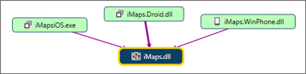
For a common XF solution (iMaps in the illustration), you will have:

  • The PCL library project (iMaps.dll): code and resources shared by all platforms
  • iMaps.iOS project: specific code, resources and configuration for iOS
  • iMaps.Droid project: specific code, resources and configuration for Android
  • iMaps.WinPhone project: specific code, resources and configuration for Windows Phone.

Each of these projects may, of course, reference other PCL or platform-specific libraries.

Xaml: where is the xaml design surface?

If you are new to XF, or are not posted yet: just relax, sit down, (have a beer if you can):

YOU DON'T HAVE an XAML DESIGN UI!

That is obviously a big missing link in Xamarin forms. Not only you are just abandoned to write xaml code without seeing its (potential) output, even your xaml typos get caught only at runtime (with a horrible app crash of course!)

Your options? Not so many:

You have Gorilla Player (promising and quickly evolving)… other approaches and efforts are also underway.

Gorilla allow you (at design time) to instantly preview your xaml content page (or content view) on a device or an emulator, and will catch your xaml errors and typos and tell you their exceptions details. It is also able to run simultaneously on Android and iOS (devices or emulators).


The application resources: the App.xaml and App.xaml.cs pitfall

It is quite useful to define a set of resources available for all objects in a project. Traditionally, in a WPF or Silverlight project, these resources are defined in App.xaml and used in other xaml files as StaticResources. If you create a WPF or Silverlight project, the project template creates two files: App.xaml and App.xaml.cs. The first is to contain the xaml resources, the second contains the application methods and properties.

When you create a new Xamarin Forms solution, your PCL project would have only an App.cs file but no App.xaml file.

To solve this:

  • Close the solution (or at least unload the PCL project)
  • Navigate to the PCL project folder
  • Rename App.cs to App.xaml.cs
  • Create a file and name it App.xaml. It should contain:


<?xml version="1.0" encoding="utf-8" ?>
<Application xmlns=http://xamarin.com/schemas/2014/forms
xmlns:x=http://schemas.microsoft.com/winfx/2009/xaml
x:Class="
[YOUR NAMSPACE].App">
</Application>

  • Edit the project (.csproj) file (using Visual Studio or a text editor like Note Pad).
  • Change this:

<Compile Include="App.cs" />


  • To this:

<Compile Include="App.xaml.cs">
<DependentUpon>App.xaml</DependentUpon>
</Compile>

  • Add this ItemGroup section:

<ItemGroup>
<EmbeddedResource Include="App.xaml">
<Generator>MSBuild:UpdateDesignTimeXaml</Generator>
<SubType>Designer</SubType>
</EmbeddedResource>
</ItemGroup>

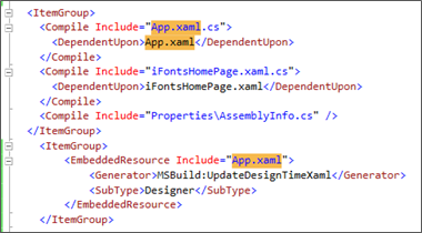
  • Save the .csproj file
  • Reload the project (or reopen the solution)
  • Finally, in your App.xaml.cs file, you should first declare you class partial (in fact, another part is generated during compilation) the App constructor should call InitializeComponent() for your resources to be usable in other xaml files.


public partial App : Application
{

public App()
{
        InitializeComponent() ;


  • You can now define application resources in App.xaml and use them the same way in WPF and Silverlight apps.

Add new item: where is the ContentView (UserControl)?

ContentViews are an interesting xaml objects that are similar to UserControl in WPF/Silverlight. It allows you to define the presentation of one or more objects that you can include in other ContentPages, ListViews and other containers.

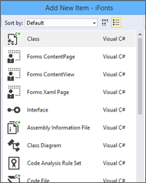
In Visual Studio, if you right click a project folder and select Add à New Item, you don't have a ContentView in the list of available items.


How to solve:

  • Select Add a Forms Xaml Page and give it the name you want (here: NewContentView1)
  • Open the xaml file of this new item
    • Change this

            <ContentPage xmlns=http://xamarin.com/schemas/2014/forms

  • To this

            <ContentView xmlns=http://xamarin.com/schemas/2014/forms

  • And, of course, this (end of file) </ContentPage> to this </ContentView>
  • Open the .cs file of this new item
  • Change this

    public partial class NewContentView1 : ContentPage

  • To this

    public partial class NewContentView1 : ContentView


This can also be done by copy / paste files and changing class names…

Craftsmanship: software is J

Files and build action pitfalls

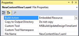
When you add an existent xaml file to your project, it sometime just breaks the project build with many weird errors. The cause is often that the xaml file has been assigned a wrong Build action.

You should check that xaml files are assigned Build Action = Embedded Resource, Do not copy, with Custom tool = MSBuild:UpdateDesignTimeXaml.


  • Android assets: should be configured with Build Action = AndroidAsset, No copy (unless copy is needed)
  • Android Resources (& drawables): Build Action = AndroidResource, No copy (unless copy is needed)
  • iOS resources: Build Action = BundleResource, No copy (unless copy is needed)
  • WinPhone assets: Build Action = Content, No copy (unless copy is needed)
  • WinPhone resources: Build Action = Embedded Resource, No copy (unless copy is needed)

Don't use custom renderers unless…

One important feature of Xamarin forms is, obviously, to bring your forms to devices' screens. That is done by built-in 'renderers' whose role is to translate the (xamarin) xaml elements attributes to their equivalent in each platform (droid, iphone, win phone…). This translation process is not yet as perfect as we may expect. It is getting better with the progress of xamarin forms versions but, still, not yet perfect.

That sometimes produces discrepancies of graphical design between platforms (control dimensions, alignments, colors… etc.)

Fortunately, Xamarin forms provides the OnPlatform object (xaml markup extension) that allows us to specify per-platform specific values for elements and styles' attributes. And we may also use the Device static class to access information about the current platform on which your application is running and set values accordingly.

Using OnPlatform, for instance, you may define button height on per-platform value:

<OnPlatform x:TypeArguments="x:Double" x:Key="normalButtonHeight"
    Android="44"
iOS="44"
WinPhone="78"/>

Then use it in a Button style:

<Style TargetType="Button">
<Setter Property="HeightRequest"    Value="{StaticResource normalButtonHeight}" />

</Style>


This can also be achieved by different other methods. For instance:

  • Use the Device static class (in the PCL project) to detect and set values according to the current platform on which your application is running
  • Define specific resources (styles / templates…) in the target platform project
  • And, ultimately, you may use a 'custom renderer' (in the target platform project), to handle the graphical attributes of your UI element before it is put on screen.

The advantage of handling things in the PCL project are obvious (Write Once, Run EverywhereJ)… There are situations where this can be impossible or undesirable. In that case specific platform code or resources can be used.

With custom renderers, things are a little different though.

Xamarin framework has a set of built-in renderers for all UI elements. These renderers are evolving relatively quickly (for the better!). When you define your own custom renderer, you in fact derive yours from one existing built-in renderer and will override some of its methods. That puts a new test/maintenance hassle on your project… and, with the evolution of built-in renderers, yours may end up by performing less effectively than the built-in one… (But will still override its features).

So: think twice before going for a custom renderer!


(More tips and pitfall solutions to follow…!)

Xamarin forms: an image source dilemma


As we saw during the first 'inside-look', Xamarin exposes the Image control (or 'View', as you like) with its Source (ImageSource) that can be either a FileImageSource, a StreamImageSource or an UriImageSource.

Most of the samples that talk about how to use Image are delivered with FileImageSource… something like this:

<Image Source="photo.png" />

Or, sometimes:

<Image Source="http://company.com/photo.png" />

Great!... it looks like the Image is quite intelligent to directly know if the source is a FileImageSource or a UriImageSource… mazing work… the guys @Xamarin are quite smart and helpful… right?

Not so fast!

After having some trouble with this (you should expect some in this juvenile environmentJ), I understood something: Many (if not all) samples about Xamarin features are often delivered with the very 'trivial' situation… as they may say: for 'pedagogic' reasons (exactly the same reason we heard in primary/secondary schoolJ)

What if we were 'mature' (if not 'professional') people?... well, apparently, you do it yourself!

In the Image case is also probably accentuated by the fact that the ImageSource is a class whose base is the Element class (which is the grand-grand-parent of the Image class!)

The case

What I had to do with Image was to display an image dynamically generated by a service call. A product image for instance which you can get with an Uri that may look like:

http://mycompany.com/myService.svc?productId=123&thumbnail=1

If you try the somehow trivial cases, you simply put:

<Image Source="http://mycompany.com/myService.svc?productId=123&thumbnail=1" />

That simply 'does not work'! (please don't ask me why J)

Fortunately, we know by other experiences that software is sometimes a craftsmanship process.

I first tried using the StreamImageSource (feeding it with a stream filled up with the bytes coming from the service)… but ended up by asking myself why this object exists (it is not probably totally useless… but it was in my case!)

Image source Binding

As you now know, real life is a little different from schools.

So, as you may imagine: I in fact will not have my Image written like this:

<Image Source="http://mycompany.com/myService.svc?productId=123&thumbnail=1" />

It will rather be written like this:

<Image Source="{Binding ProductImageSource}" />


ProductImageSource property in this case was returning a string containing the address for getting the image. Counting on the Image intelligence for translating this address to an UriImageSource. Which did not work.

The solution (that works… and not only on my machine!)

Let us change the ProductImageSource from a string to its meaning: an ImageSource.


public ImageSource ProductImageSource 
{ 
    Get {    return GetImageUriSource(ProductImageUrl, 5.0);     } 
}


GetImageUriSource, a helper method somewhere (in a static class for instance) can do this work for products or other objects when needed:

public static ImageSourceGetImageUriSource(string strUrl, double cacheDurationMinutes) 
{ 
    if (string.IsNullOrEmpty(strUrl)) 
        return null; 

    // escape the url
    strUrl        = Uri.EscapeUriString(strUrl); 
 

    if(!Uri.IsWellFormedUriString(strUrl, UriKind.RelativeOrAbsolute)) 
        return null; 

    Uri            imgUri        = new Uri(strUrl); 

    return new UriImageSource() 
    { 
        CachingEnabled = true, 
        Uri                 = imgUri, 
        CacheValidity = TimeSpan.FromMinutes(cacheDurationMinutes) 
    }; 
}


That works!