Taoffi's blog

prisonniers du temps

Xamarin forms backyard - exploring MSBuild projects

In a previous post, I talked about how to manually change the project (.csproj) file to create an App.xaml and App.xaml.cs files in a Xamarin forms project. The reason for this is to be able to declare and use global application resources (styles, assets… etc.) linked to the main application file (App.cs changed to App.xaml.cs). That is, in a way, to repair a guilty XF project template that doesn't create these items by default.

Like in all development processes, when you use xamarin forms, you spend your time coding and building your projects.

In Windows, this essential build process goes through MSBuild which reads and interprets .csproj file's instructions into specific actions to compile and package your applications.

Those .csproj files are XML files containing configurations, variables and instructions… many can be manipulated in Visual Studio or Xamarin Studio. Still, some of these configurations require a deeper dive into MSBuild details. Your project, for instance, may sometimes fail to build for reasons that are difficult to trace without such dive.

Diving into MSBuild is something different from simply reading the .csproj xml instructions.

Understanding the way these instructions would be interpreted and handled by MSBuild is crucial for your investigations success.

MSBuild API to the rescue

Fortunately, MSBuild offers an API that allows you to explore or modify the build engine behavior according to your requirements.

I used this API to build a simple MSBuild browser (Windows WPF application) that allows you to examine the detailed interpretations of MSBuild to a .csproj or .vbproj file.

A project configuration browser

The browser uses the objects defined in the MSBuild Microsoft.Build.Evaluation namespace.

Three main view models of the application are used to represent MSBuild objects:

  • iProject: msbuild project view model. Encapsulates the collection of:
  • iProjectItemType: project item types (and actions). Each project item type encapsulating a collection of:
  • iProjectItem: an item of the related type. This object encapsulates a property bag of the related MSBuild item's properties (For instance: metadata).


PropertyBag object is used to allow future application extensibility. It parses MSBuild objects' properties independently of the version referenced (the current application references MSBuild 14.0.0.0).


The result looks like this:


You can download the binaries Here

If you are interested in extending features, you can download the source code here.


Xamarin forms – the OnPlatform<T> heavens!

Xamarin forms offer this class (OnPlatform<T>) of great help to adapt your code (either c# or Xaml) to the current runtime device's platform.

So you may write:

string helloDevice = Device.OnPlatform<string>(
            "Hello iOS", "Hello Droid", "Hello Win Phone");

 At runtime, on iOS, your string would have the related platform value:

In Xaml, you specify the type to which the OnPlatform should act and the values for each platform:

<ContentPage.Padding>
   <OnPlatform x:TypeArguments="Thickness">
      <OnPlatform.iOS>0, 20, 0, 0</OnPlatform.iOS>
      <OnPlatform.Android>0, 0, 0, 0</OnPlatform.Android>
      <OnPlatform.WinPhone>0, 0, 0, 0</OnPlatform.WinPhone>
   </OnPlatform>
</ContentPage.Padding>

The main difficulty in Xaml is that you should know exactly the Type to pass as TypeArgument.

For system known types, you should use the x: prefix like in:

x:TypeArguments="x:String"
x:TypeArguments="x:Double"
x:TypeArguments="x:Int32"

For Xamarin Forms objects properties and types, it is easy to use the Visual Studio Object Browser to obtain the correct information:

Here, for instance, you know that the Padding is of type Xamarin Forms Thickness:

    <OnPlatform x:TypeArguments="Thickness">


Xamarin forms maps – let’s talk renderers: 1. Win Phone

I continue about XF maps, where a custom renderer is needed if you want to customize appearance and interaction.

As most Xamarin forms samples about maps expose renderers for Droid and iOS (I did not see any about WP), I will start by exposing a sample for that 'missing' renderer. Another post will follow with some ideas about the renderers for the other platforms.


In this sample, we handle SamplePlace objects (see below) through our custom map and custom pin objects (see previous post)

What we want:

  • Display custom pushpins (icons specified for each custom pin)
  • When a pushpin is clicked, display a custom information callout about the place.


The way to do this:

The renderer (which derives from MapRenderer) receives our custom map, containing the map pins. The binding context of each Pin is set to the related custom pin. The place data is accessed through the custom pin's DataObject.

The renderer has two levels of duties:

  • A 'formal' role inherited from the default renderer: create and display the specific platform map control, position the pins on it and define the interaction with the control's events (map taps / pins taps / callout taps…).
  • A customization role: use our specific embedded information to customize pins' appearance and callouts.


The renderer code

Our renderer class:

public class iCustomMapRenderer : ViewRenderer<iCustomMap, Map>


For Xamarin.Forms.Maps to retrieve our renderer at runtime, it should be 'exported'. The code should now be like the following:


// Note: ExportRendererAttribute is defined in Xamarin.Forms namespace
[assembly: ExportRenderer(typeof(iCustomMap), typeof(iCustomMapRenderer))]

namespace iMaps.WinPhone
{
	public class iCustomMapRenderer : ViewRenderer<iCustomMap, Map>
	{
		private Map				_winMap;			// the win phone map control
		private iCustomMap		_xfMap;				// the xamarin forms map we are handling
		private iCustomPin		_selectedPin;	// our current slected pin

		// the callout user control that will display selected place info
		UserControl	_placeInfoCtrl	= new UserControl()
		{
			HorizontalAlignment	= HorizontalAlignment.Stretch,
			VerticalAlignment		= VerticalAlignment.Stretch,
			MinHeight			= 300,
			Background			= whiteBrush,
		};
		…


Here is a global view of the renderer's methods:


In the ElementPropertyChanged (override), we will:

  • Create the win phone map control.
  • Parse the received pins, and use their specified icons as pushpins.
  • Subscribe to each pushpin Tap event to display the callout.
  • Subscribe to the map Tap event to hide any displayed callout.


// Center the map on the 1st pin
var			pin	= _xfMap.Pins[0];

// create the win phone map control. set as the native control
_winMap		= new Map
		{
			ZoomLevel = 13,
			Center = new GeoCoordinate(pin.Position.Latitude, pin.Position.Longitude)
		};

this.SetNativeControl(_winMap);

// subscribe to map Tap event (to unselect last pin if any)
_winMap.Tap		+= WinMap_Tap;

// AddCurrentLocationToMap();
// loop through the received pins. display each with its custom pin icon
foreach (var formsPin in _xfMap.Pins)		//.CustomPins)
{
	var			pushPin		= new Pushpin();
	iCustomPin	customPin	= formsPin.BindingContext as iCustomPin;
	SamplePlace	place		= customPin == null ? null 
										: customPin.DataObject as SamplePlace;

	// subscribe to the pushpin tap event (to display the callout)
	pushPin.Tap += PushPin_Tap;

	// set the pushpin position on the map
	var geoCoordinate			= new GeoCoordinate(formsPin.Position.Latitude, formsPin.Position.Longitude);
	pushPin.GeoCoordinate		= geoCoordinate;

	// set the pushpin tag to the custom pin
	pushPin.Tag					= customPin;
	…
	…


The custom pushpin icon

To put a UI element on the map, you create a MapOverlay containing the element on the desired location (geo coordinate) and you add that MapOverlay to a Layer that you put on the map.

A Pushpin (defined in Microsoft.Phone.Maps.Toolkit namespace) is a UI element that exposes a Content property (of type ContentControl) which we can set to our image of choice (the one specified by the custom pin object for instance). In that case, the pushpin would look like this:

We may also directly put our image on the MapOverlay. In that case that would be like this:


The callout control

Let us create a (win phone) xaml UserControl for displaying place object's information. We will use this when a pushpin will be tapped.


<Border x:Name="LayoutBorder" Background="Transparent" Height="auto" Padding="8" >
	<Grid VerticalAlignment="Top" Background="Transparent">
		<Grid.RowDefinitions>
			<RowDefinition Height="24" />
			<RowDefinition />
		</Grid.RowDefinitions>
		<Grid.ColumnDefinitions>
			<ColumnDefinition Width="24" />
			<ColumnDefinition />
		</Grid.ColumnDefinitions>

		<Image Source="{Binding Source, Source={StaticResource imgMapPointer}}" Grid.Column="0" Grid.Row="0" Stretch="Fill" Height="24" Width="24" HorizontalAlignment="Left" VerticalAlignment="Top" />

		<Border Padding="8" Background="White" Grid.Row="0" Grid.Column="1" Grid.RowSpan="2">
			<StackPanel>
				<Image x:Name="imgPlace" Height="128" Width="128" HorizontalAlignment="Left" Source="{Binding Converter={StaticResource placeImageConverter}}" Margin="8" />
				<TextBlock FontWeight="Bold" Text="{Binding Name}" Foreground="Black" />
				<Rectangle Height="1" Fill="Black" HorizontalAlignment="Stretch" />
				<TextBlock Margin="8,0" FontSize="14" Text="{Binding MapPinText}" Foreground="Black" />
			</StackPanel>
		</Border>
	</Grid>
</Border>


At design time, the code above would look like:

At runtime, the Pushpin Tap event handler will set the control's DataContext to the selected SamplePlace object. It will then display its image and information.

The pushpin Tap event handler determines the currently selected place (through the pushpin.Tag) and calls this method to update the control:


void UpdateInfoControlContents(SamplePlace place)
{
	_placeInfoCtrl.ClearValue(UserControl.ContentProperty);

	if(place == null)
		return;

	PlacePushPinInfoCtrl ctrl = new PlacePushPinInfoCtrl() { DataContext = place };

	_placeInfoCtrl.Content = ctrl;
}


There is certainly still much to do for these mechanics to produce something elegant and informative.

That may just be a good start.... Download the code and have more fun!

In a following post I will talk about some ideas for Droid and iOS map renderers (also included in the sample).

Xamarin forms: appCompat & rounded buttons, cleaner solution!

This is a follow up for my last post about AppCompat and rounded buttons where your custom renderer would not be called!

In that post, I exposed a 'hack' solution which is better be avoided.

On this page (the same where Kelly Adams presented a decompiled code of the AppCompat launcher), Thomas Omer-Decugis exposed a simple and efficient solution: you create a new class that derives from Button and create (in the Droid project) your custom renderer for this class.

In that case, your renderer is called and can proceed to handling properties like BorderRadius that are ignored by AppCompat.


public class iRoundedButton : Button 

In this screen capture, the first 2 buttons are standard buttons (where border radius is not handled by AppCompat)

The following 2 are defined as: (xmlns:local="clr-namespace:iRoundedButton")

<local:iRoundedButton … 


And where the custom renderer handles the border radius.


The custom renderer itself is the same as in the previous sample, with this minor change:

[assembly: ExportRenderer(typeof(iRoundedButton /*Xamarin.Forms.Button*/), typeof(CustomButtonCompatRenderer))]

Xamarin forms – what about maps?

Why do we use maps?

Apart from the pleasure (and poesy) of locating things in the global earth space, there is something practical and useful in using maps and geolocation.

I myself could never be able to live in big cities without mapping applications guiding me from a place to another and giving me such vital information like 'where can I park my car' (almost a dilemma in European cities at leastJ)

As we talk about maps, we of course talk about mobility (and vice versa). That puts it in a way where we might think that a mobile app is often linked to mapping features: if your app sells something (it often doesJ), the user will inevitably ask: where is it? How can I go there?... etc.

Xamarin forms maps package

The Xamarin forms maps package delivers a good solution to integrate maps into your XF applications.

A nice sample is delivered that explains how to get started with the package.

To avoid some of startup pitfalls, I compiled my own pitfalls and solutions here.

The package (Xamarin.Forms.Maps.dll) contains a few useful objects:


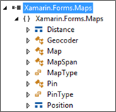
Xamarin.Forms.Maps - What / Who lives there?

The component exposes three main objects:

  • Map object (a View)
  • MapSpan object
  • Pin object (a BindableObject)

Finally an object: Geocoder for geocoding operations (that I didn't find really useful or simply operational)

More details and Inheritance

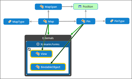
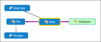
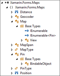
A Map (deriving from View) is of:

  • MapType (enumeration)
  • It has two MapSpan(s) representing the VisibleRegion and the LastMoveToRegion
  • And it contains a collection of Pin(s) (IList<Pin>)

A MapSpan is composed of its center (a Position: a structure of Latitude, Longitude), dimensions in terms of Distance (a structure with some factory methods (FromKilometers, FromMiles…) to apply values using known distance units).

The good news is that the Pin is a BindableObject. We will see how to use this to extend some features.

Extending Xamarin Forms Maps

You can simply use the maps package with its provided features and obtain good and useful results for your app's users: display pins on the map, when a pin is clicked, its label is displayed, and you can respond to that label's Tap event to open your selected item's specific form. That can be enough in many cases.

Other more demanding apps may need, for instance, to customize pin appearance and/or the callout for each pins… etc.

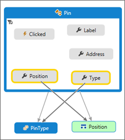
The standard Pin object is limited to handling objects' Address (string), Label (string), Position (coordinates) and pin Type (enumeration: Generic, Place, SavedPin or SearchResult). It also exposes a Clicked event to which your app can subscribe.


It does not handle other features that you may need… like specifying a pin icon, or a custom callout.

So, you think: still, we can derive a custom pin object that may provide such requested information.

Unfortunately that is not possible because Pin is a sealed class! (Why is it sealed?... mystery!. I hope the creators have good reason for this choice. For now, I find this a little strange)

Customizing maps: yet another solution

I found some interesting efforts to extend and circumvent the Xamarin maps limitations.

You may have a look at some Here… or Here.

Most efforts concentrate on offering Custom rendering solutions (For Droid and iOS. Few, if any, expose a Win Phone workable renderer).

The fact that we need a custom renderer for maps is inevitable if we opt to using the specific platform mapping features (which seems the reasonable choice). A structured (architectural) approach is required in any case.

What we want to handle in this sample, is a Place object:

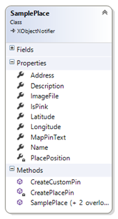
It contains information about its location (latitude, longitude, address…) and other properties (Name, description, image…)

What we need in our current sample is:

  • Display a custom pushpin according to the type (category) of the Place at the pin location.
  • Display a custom callout when the pin would be clicked.
  • Raise a Clicked event when the callout would be tapped.
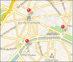
Instead of this:

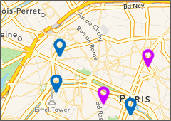
We would like to have something like this :

As we cannot inherit the Pin class (sealed), let us create an iCustomPin class containing the target map Pin and providing the required customization features (here the pin's icon):

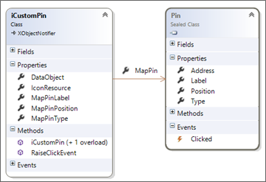
The iCustomPin class will act as a view model for the Pin, thus providing some (gets) of its properties: MapPinLabel, MapPinPosition, MapPinType… etc.

It exposes a DataObject (an 'object', which will contain a Place object in the current sample… Note: That may be refactored to a BindableProperty)

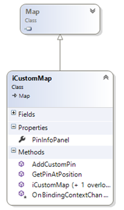
An iCustomMap object (deriving from the Xamarin forms Map) will be in charge of inserting / updating our custom pins. It may also provide a custom Callout control template (ContentView) that can be used for displaying the selected (Clicked) pushpin.

How these objects can be used?

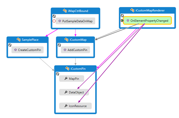
The sample execution sequence can be as follows:

  • Data: create a list of sample places, each containing coordinates, description…
  • View: Insert a custom map control (iCustomMap object) into the page
  • For each ample place, add the corresponding custom pin (iCustomPin) to the custom map:
    • A custom pin contains a 'standard' Pin
    • Set standard Pin's BindingContext to the custom pin. (The custom pin contains the Data Object… which is the Place)
  • Rendering: the custom renderer, at each platform, can access the custom pin info (and thus the sample Place) through the Pin's BindingContext… It would then display the pushpins according to the specified icon asset, and eventually displays the place's callout when required.


In a following post, I will expose custom renderers details for Android and WP.

Will also try to polish the sample code a little more before publishing for download. Will keep you posted when readyJ

Xamarin Forms Maps – a (very) quick start!

Solutions to avoid some pitfalls for starting up with Xamarin forms maps package.

Before to use?

Some steps are required for your map application to be able to start and to display maps.


In Android project, before to use maps, you must first generate an API key. This can be done in your google account (create one if needed). You can optionally in this step link your API key to a specific application. This API key should be specified in the AndroidManifest.xml of your Android project:

<application android:label="Your app name" android:icon="@drawable/your icon">
    <meta-data android:name="com.google.android.geo.API_KEY"
            android:value="put you api ur key" />
<meta-data android:name="com.google.android.gms.version"
        android:value="@integer/google_play_services_version" />
</application>


In this same file, you should also specify the required location access permissions:


For iOS, you should specify the some values for the following keys in info.plist file:

<key>NSLocationAlwaysUsageDescription</key>
<string>Please allow us to use your location.</string>
<key>NSLocationWhenInUseUsageDescription</key>
<string>We are using your location</string>


For WinPhone, you should specify some application capabilities as (at least):


For All platforms:

In each platform, call Xamarin.FormsMaps.Init(); after Xamarin.Forms.Forms.Init()

Without this call, your map will not show!

  • iOS - AppDelegate.cs file, in the FinishedLaunching method.
  • Android - MainActivity.cs file, in the OnCreate method.
  • Win Phone - MainPage.xaml.cs file, in the MainPage constructor.


That is what the Xamarin Forms Maps documentation saysJ. In fact I tested: that is required for iOS, not required for Android… and for Win Phone… just a minute… the emulator is starting up… IT IS required!


How to use?… Look at it working

To use these items, you simply insert a Map View in your Xaml page (or ContentView). Which can also be done in code. In xaml, don't forget to mention the namespace!

Here is an example of a ContentView (a UserControl for our WPF/Silverlight friends!)

<?xml version="1.0" encoding="UTF-8"?> 
<ContentView    x:Class="iMaps.iMapCtrl1" 
    xmlns="http://xamarin.com/schemas/2014/forms" 
    xmlns:x="http://schemas.microsoft.com/winfx/2009/xaml" 
    xmlns:map="clr-namespace:Xamarin.Forms.Maps;assembly=Xamarin.Forms.Maps" 
    > 
    <map:Map x:Name="theMap" /> 
</ContentView> 


Important remark: for a mysterious reason (you will see many in Xamarin environment), if the 'map' namespace specifies the assembly's extension ('.dll') that doesn't work in WinPhone (i.e. app crash!)

Should write this:

xmlns:map="clr-namespace:Xamarin.Forms.Maps;assembly=Xamarin.Forms.Maps"

Not this (results in WinPhone crash):

xmlns:map="clr-namespace:Xamarin.Forms.Maps;assembly=Xamarin.Forms.Maps.dll"


Now, for this sample, we can insert some Pins at the ContentView (UserControl) creation:

public iMapCtrl1()
{
    InitializeComponent();
    PutSomePinsOnMap();
}


void PutSomePinsOnMap()
{
    // define a center point and some sample pins
    Position        tourEiffel    = new Position(48.859217, 2.293914);
    Pin[]        pins            =
    {
        new Pin() {  Label = "Tour Eiffel",
            Position = new Position(48.858234, 2.293774), Type = PinType.Place },
        new Pin() {  Label = "Concorde",
            Position = new Position(48.865475, 2.321142), Type = PinType.Place },
        new Pin() {  Label = "Étoile",
            Position = new Position(48.873880, 2.295101), Type = PinType.Place },
        new Pin() {  Label = "La Défense",
            Position = new Position(48.892418, 2.236180), Type = PinType.Place },
    };

    foreach(Pin p in pins)
    {
        theMap.Pins.Add(p);
    }

    // center the map on Tour Eiffel / set the zoom level
    theMap.MoveToRegion(MapSpan.FromCenterAndRadius(tourEiffel, Distance.FromKilometers(2.5)));
}


Once this ContentView in a Page that gives a nice view like this:


Xamarin forms: so you lost your rounded buttons?

Xamarin forms buttons can have rounded corners. Well… eventually, in Win Phone, you should handle this in a custom renderer or in a control template… we will see this in another post.

For other platforms, the way to do this is quite simple:

<Button Text="I am rounded" BorderRadius="20" BackgroundColor="Gray" />  

Android AppCompat issues

That works great on Android, until you install the Xamarin AppCompat package!

AppCompat just strips away your rounded corners and you find your button with the traditional rectangular old style!


Well… what is 'AppCompat'?

It is an android specific feature presented by Xamarin as:

…devices running earlier versions of Android could enjoy the beauty of Material Theming. With the latest enhancements in Xamarin.Forms 1.5.1, you can easily utilize all of the new AppCompat features, including Material Design and Theme, with just a few changes to your app code.


What about Win Phone and iOS in benefiting from such an interesting approach?... nobody knows for the moment. I thought we were in a cross-platform context… apparently that doesn't always apply!


In any case, with this great feature you simply lose some of the 'beauty' you had before in your 'traditional' environment. C'est le progrèsJ

Before AppCompat:

Android

iOS

After:

Android (AppCompat)

iOS (no AppCompat)


Many discussions on Xamarin forums suggest this is a 'bug'… it is not. And this thread clarifies a little bit about XF choice in AppCompat:

The old Xamarin.Forms.Platform.Android.ButtonRenderer uses the internal Xamarin.Forms.Platform.Android.ButtonDrawable which does respect it.
So you should file a bug on bugzilla (if there is none already) and write a custom renderer until they fix it.
Be sure to inherit from Xamarin.Forms.Platform.Android.AppCompat.ButtonRenderer and not from Xamarin.Forms.Platform.Android.ButtonRenderer in your renderer.


An interesting article (@wintellect) provides a valuable solution to implement a button renderer in Xamarin forms. Adapting the provided code to AppCompat is not much work.

By now, that should be done… let us start deploy and see. Nothing. My button is still with no rounding corners!

A debug session simply reveals that my new custom renderer is NEVER CALLED!


Surfing again for an answer for such strange situation, I found this answer:

Kelly Adams took the time to decompile FormsAppCompatActivity.LoadApplication and gives us a more clear answer as to why our custom renderer is never called: it is in fact simply IGNORED!

Such discrepancies make me feel: Xamarin platform is still immature!


This week's Hack!

AppCompat simply registers its own renderers and ignores all the rest for the following controls: Button, CarouselPage, Frame, MasterDetailPage, NavigationPage, Picker, Switch, TabbedPage and (finally) View (this last one seems to have been added after a deep thought?J)


Kelly Adams revelation opens a door for hacking!

In fact there is a Boolean field (renderersAdded) in that class. And 'default' renderers are loaded if it is still false.

So, an acrobatic solution would be to set that field to true and register your own renderers so that they can be called. So silly but effective (at least for nowJ)


// get the AppCompat activity Type information
Type         appCompact = typeof(FormsAppCompatActivity);

// get the field info (even if it is private!)
FieldInfo    renderersAdded = appCompact.GetField("renderersAdded", 
                              BindingFlags.Instance | BindingFlags.NonPublic);

// set the field value to true (fool the loader not to load its default renderers
renderersAdded.SetValue(this, true);

// get the registration method
MethodInfo regMethod = appCompact.GetMethod ("RegisterHandlerForDefaultRenderer", 
                              BindingFlags.Instance | BindingFlags.NonPublic);

// set your own renderers J
regMethod.Invoke(...


So sad… But that is the price to go for such 'unfinished' implementation of an API

Be prepared to change this in the future: the unfinished API may get a little more polished! 


That works (for nowJ)

You may have a look at the sample code for more details.

Xamarin forms – extending the BindableObject


This a follow up to my post about avoiding strings in notifying property change events.

In fact, objects deriving from BindableObject (Views, Pages…) are some of the most common places where we do notify property changes.

These notifications are naturally done using the OnPropertyChanged method of the root BindableObject. Which is presented as:


protected virtual void OnPropertyChanged([string propertyName = null])

Member of Xamarin.Forms.BindableObject
Summary:

Call this method from a child class to notify that a change happened on a property.
Parameters:

propertyName: The name of the property that changed.
Remarks:

A Xamarin.Forms.BindableProperty triggers this by itself. An inheritor only needs to call this for properties without Xamarin.Forms.BindableProperty as the backend store.


So if you have a property that requires change notification, you would write:

    this.OnPropertyChanged("myPropertyName");


Which brings again the string constant problem: if you, one day, change the name of your property, you should remember visiting all code that may use this name in a string constant… hard and risky labor!


I thought of extending the BindableObject by providing a new OnPropertyChanged method using the Linq.Expressions to avoid string constants. That cannot be straightforward though because the BindableObject's OnPropertyChanged is protected!


For now, I found this solution. Please feel free to change or adapt to your needs. If you may find a better way, I would be happy to hear about your solutions!


The recipe

Define a delegate signature of a method to be called:

    public delegate void PropertyChangedHandler(string propertyName); 


Define a class for this (and future) extensions:

    public static class BindableObjectExtensions 


Include this extension method in the class:


public static void OnPropertyChangedExt<TProperty>(this BindableObject obj,
                    Expression<Func<TProperty>> property,
                    PropertyChangedHandler propertyChangedHandler)
{
        if (property == null || propertyChangedHandler == null)
            return;


        string        name = GetPropertyName(property);
        propertyChangedHandler.Invoke(name);
}


The GetPropertyName helper method:


public static string GetPropertyName<TProperty>(Expression<Func<TProperty>> property)
{
    if (property == null)
        return null;


    var expression = property.Body as MemberExpression;


    if (expression == null || expression.Member == null)
        return null;


    return expression.Member.Name;
}


Sample usage


public class TestBindableExtension: BindableObject
{
    string        _test        = "Test";


    public string TestProperty
    {
        get { return _test; }
        set
        {
            _test = value;
            this.OnPropertyChangedExt(() => TestProperty, this.OnPropertyChanged);
        }
    }


Xamarin forms – the complete WP circle image!

James Montemagno published a post about implementing circle images using Xamarin Forms.

His proposed implementation for Win Phone was good. It clipped the image into a circle, but stopped a little short to draw the circle image border.


Droid

WP


I played with this to solve this small issue.

Here is a more complete version for WP renderer:

protected override void OnElementPropertyChanged(object sender, PropertyChangedEventArgs e)
{
	base.OnElementPropertyChanged(sender, e);

	CircleImage		circleImg	= Element as CircleImage;

	if(circleImg == null || Control == null || Control.Clip != null || circleImg.Source == null)
		return;
			
	double		controlRadius	= Math.Min(Element.Width, Element.Height) / 2.0f;
	double		controlDiameter	= controlRadius * 2.0;

	if(controlRadius <= 0)
		return;


	// **********************************************
	// Note: this section ignores PNG transparency. 
	// **********************************************
	try
	{ 
		BitmapImage			srcBmp		= Control.Source as BitmapImage;

		WriteableBitmap		wrBmpSrc	= new WriteableBitmap((int) controlDiameter,
												 (int) controlDiameter);
		ImageBrush		imgBrush	= new ImageBrush();

		// use an image brush with the control’s image
		imgBrush.ImageSource = srcBmp;

		// set border thickness
		int	borderThickness	= circleImg.BorderThickness;
		Color	borderColor			= XamarinColor2WinColor(circleImg.BorderColor);

		// create a path with an ellipse geometry
		EllipseGeometry				ellipseG	= new EllipseGeometry()
			{
				Center		= new System.Windows.Point(controlRadius, controlRadius),
				RadiusX		= controlRadius,
				RadiusY		= controlRadius
			};
		GeometryGroup				geomGroup	= new GeometryGroup();

		geomGroup.Children.Add(ellipseG);

		System.Windows.Shapes.Path	path		= new System.Windows.Shapes.Path()
		{
			Stroke 		= new SolidColorBrush(borderColor),
			StrokeThickness	= borderThickness,
			Data			= geomGroup,
			Width			= controlDiameter,
			Height		= controlDiameter,
			Fill			= imgBrush,
		};

		wrBmpSrc.Render(path, null);
		wrBmpSrc.Invalidate();

		using (MemoryStream memStream = new MemoryStream())
		{
			wrBmpSrc.SaveJpeg(memStream, wrBmpSrc.PixelWidth, wrBmpSrc.PixelHeight, 0, 100);

			srcBmp.CreateOptions = BitmapCreateOptions.IgnoreImageCache;

			srcBmp = new BitmapImage();
			srcBmp.SetSource(memStream);
		}

		Control.Source			= srcBmp;
	}
	catch(Exception ex)
	{
		Debug.WriteLine(ex.Message);
		return;
	}

	// clip the control into circle
	Control.Clip = new EllipseGeometry
		{
			Center	= new System.Windows.Point(controlRadius, controlRadius),
			RadiusX	= Math.Max(controlRadius, 0),
			RadiusY	= Math.Max(controlRadius, 0)
		};
}


Color conversion helper method


		public static Color XamarinColor2WinColor(Xamarin.Forms.Color xamColor)
		{
			return Color.FromArgb (	(byte)(xamColor.A * 255),
									(byte)(xamColor.R * 255),
									(byte)(xamColor.G * 255),
									(byte)(xamColor.B * 255));
		}


Droid

WP


Xamarin forms fonts: Handling droid formatted text spans

As we have seen in a previous post, it is relatively easy to handle custom fonts using Xamarin forms. The only tedious platform in this domain is Android where you need to write a custom renderer.

In the first version of Droid custom renderer, I didn't handle the Labels Formatted Text.

Formatted texts can be used like in this sample:


<Label>
    <Label.FormattedText>
        <FormattedString>
            <FormattedString.Spans>
                <Span
                    Text="Allura span"
                    ForegroundColor="Lime"
                    FontSize="36"
                    FontFamily="{StaticResource fontAlluraName}"
                    />
                <Span
                    Text=" "
                    FontSize="{StaticResource awesomeSize}"
                    ForegroundColor="Lime"
                    FontFamily="{StaticResource fontawsomeName}"
                   />
           </FormattedString.Spans>
        </FormattedString>
    </Label.FormattedText>
</Label>


That is a Droid-only problem!

In Windows Phone and iOS, once the fonts have been included in the project, you have nothing to do. The problem is with the Droid custom renderer!

Android has a font Typeface which acts on the Label globally, and another Type 'TypefaceSpan' which acts on a region (span) of the label's formatted text.

In the first version of Droid renderer sample, we have set the font TypeFace for the label. If that label contained formatted text with spans, they were simply ignored (rendered with a default system font).


TypefaceSpan (namespace Android.Text.Style in Mono.Android.dll) is a class derived from à CharacterStyle whose role is to draw a span's text with the specified font family name.


A solution

After searching the Internet for a while, the question didn't seem to have many people talking about.

Luckily, I fall on a piece of code (a secretJ) where I found a link about an awesome solution proposed in this page.

In fact, you may derive a class based on TypefaceSpan, and override its methods according to your specific information (notably the span's font and its attributes).


A Label object has a FormattedText member which may contain one or more text Spans. Each span has a set of properties of which you find the font family (and font attributes) to be applied to the span's text.

So that now becomes manageable: your derived CustomTypefaceSpan can then create the font and draws the span's text accordingly.


The updated version of the sample code contains more details. Have fun doing more additions… would be nice to keep me posted!